Road accidents in France from 2005 to 2016, visualised with R
Table of Contents
This post was originally published in French on 14 November 2017.
While learning R, I am going to try to put my newly acquired knowledge into practice through a basic mini-study on the data for road accidents involving injuries in France between 2005 and 2016. My goal is not to study this data in depth (that would take a lot more time, analysis and cross-referencing with other information!), but simply to get further into the use of some R packages, in particular {ggplot2} and {ggmap} for the charts. Since it is by making mistakes that you learn, do not hesitate to tell me through the comments about any slips you might spot. So let’s try to bring out a few trends about road accidents …
The source code (in R Markdown format) is available on Github. If you want to learn more about the various packages used ({readr}, {dyplr}, {ggplot2}, etc), do not hesitate to take a look at the very good book R for data science.
The road accident data is published as Open Data on the data.gouv.fr platform, the French government’s open data portal. Let’s start with a few clarifications about this data:
- It only covers road accidents involving injuries, that is to say accidents “that happened on a road open to public traffic, involving at least one vehicle and resulting in at least one casualty requiring treatment” (so no minor scrapes)
- The data covers 12 years, from 2005 to 2016
- For a single accident, the information is spread across 4 separate datasets: its characteristics, the vehicles involved, the people involved, and details about the location
- The data is spread over 48 datasets and totals 4,989,364 observations
Importing and cleaning the data #
Before any manipulation or visualisation of the data, we first have to import it and clean it. I first started to explore the accidents by importing the 4 datasets of one particular year. That method works well when the study covers a few datasets, but when it comes to exploring a large number of files, as in our case with the 48 accident datasets, you have to think about a way to automate the imports.
On data.gouv.fr, the list of files of a dataset (and their metadata, such as the date of last modification, etc) is available in RDF format in several serialisations: RDF/XML, Turtle, JSON-LD, Trig or N3. You can find all these versions in the <link rel="alternate" ...> tags in the source of the dataset page. We are going to use the JSON-LD version with the {jsonlite} package.
Here is an overview of the information we are interested in in this JSON-LD:
datasetsList <- fromJSON('https://www.data.gouv.fr/datasets/53698f4ca3a729239d2036df/rdf.json')$`@graph` %>%
  select(title, downloadURL) %>%
  filter(str_detect(title, 'caracteristiques_|lieux_|usagers_|vehicules_'))
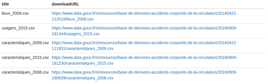
This collection will therefore let us import all the datasets easily and automatically. The goal is to end up with one data.frame for each of the 4 categories of data: characteristics, vehicles, people and locations. Each data.frame will thus contain the merge of all the available years of data. I created a function named importDatasetsByTitle() that will let us import and merge all the accident files, filtering them by their titles (topics):
#' Returns a data.frame that contains all the rows from the data files for a specific dataset provided by the data.gouv.fr platform
#' All the rows from the datasets whose the titles match 'titleFilter' will be merged together
#' @param datasetId The dataset ID from data.gouv.fr. It can be found within the source code of the dataset page within the "@id" attribute
#' @param titleFilter The string for filtering the datasets titles in order to select only the relevant ones
#' @param colTypes The column specification created through cols()
#' @param delim Single character used to separate fields within a record
#' @param stringLocale The datasets locale
#' @return The data.frame for the specified accidents category
importDatasetsByTitle <- function(datasetId, titleFilter, colTypes, delim = ',', stringLocale = locale(encoding = "Latin1")) {
  filteredDatasets <- fromJSON(paste('https://www.data.gouv.fr/datasets/', datasetId, '/rdf.json', sep=''))$`@graph` %>%
    select(title, downloadURL) %>%
    filter(str_detect(title, titleFilter)) %>%
    mutate(dataset = map2(downloadURL, delim, read_delim, locale = stringLocale, col_types = colTypes))

  bind_rows(filteredDatasets$dataset)
}
Note: the importDatasetsByTitle() function can perfectly well be used to import and merge other datasets on datagouv.fr.
The files are broadly clean, but I still noted these few points:
- Only one of the 48 files,
caracteristiques_2009.csv, is in TSV format, go figure … - The dates are spread across 4 columns:
an,mois,jourandhhmm - The hours and minutes of the accidents are concatenated into a single column, with the leading
0omitted for the hours from 00 to 09 and for the minutes from 01 to 09. As the documentation is not clear on this point, we have to make our own interpretation when faced with values like ‘45’: is it 04:05 or 04:50? Or again, does the value ‘1’ correspond to 00:01 or to 01:00? In this case, I considered that these were hours (‘1’ = 01:00). That is notably why there is no accident at all between midnight and 1am in the charts by hour … I hope this column will be corrected soon!
The toDate() function will let us rebuild a datetime object from the different variables:
#' Convert year, month, day and hm variables into a valid date object
#' @param year
#' @param month
#' @param day
#' @param hm concatenated hours and minutes
toDate <- function(year, month, day, hm) {
  date <- str_c('20', str_pad(year, 2, "left", "0"), '-', str_pad(month, 2, "left", "0"), '-', str_pad(day, 2, "left", "0"), ' ')

  if (str_length(hm) == 1) {
    hm <- str_c('0', hm, ':00')
  } else if (str_length(hm) == 2) {
    hm <- str_c('0', str_sub(hm, 1, 1), ':0', str_sub(hm, 2, 2))
  } else if (str_length(hm) == 3 && str_sub(hm, 1, 1) != 0) {
    hm <- str_c('0', str_sub(hm, 1, 1), ':', str_sub(hm, 2, 3))
  } else if (str_length(hm) == 3 && str_sub(hm, 1, 1) == 0) {
    hm <- str_c(str_sub(hm, 1, 2), ':0', str_sub(hm, 3, 3))
  } else {
    hm <- str_c(str_sub(hm, 1, 2), ':', str_sub(hm, 3, 4))
  }

  str_c(date, ' ', hm)
}
# Note : there is surely a cleaner and more optimised way to format the hours and minutes correctly ...
Now let’s import the data for each of the 4 topics:
datasetId <- '53698f4ca3a729239d2036df'

specificationsCols <- cols(
  Num_Acc = col_character(),
  com = col_character(),
  lat = col_double(),
  long = col_double(),
  dep = col_character()
)

accidentsSpecifications <- importDatasetsByTitle(datasetId, 'caracteristiques_(?!2009)', specificationsCols)

# Handle 2009 file (in TSV format ...)
accidentsSpecifications2009 <- read_delim(
  'https://www.data.gouv.fr/s/resources/base-de-donnees-accidents-corporels-de-la-circulation/20160422-111851/caracteristiques_2009.csv',
  '\t',
  locale = locale(encoding = "Latin1"),
  col_types = specificationsCols
)

accidentsSpecifications <- bind_rows(accidentsSpecifications, accidentsSpecifications2009)

# Add some alternative date formats to accidentSpecifications data.frame, it will be needed for the charts below
accidentsSpecifications <- mutate(accidentsSpecifications,
    datetime = ymd_hm(pmap(list(an, mois, jour, hrmn), toDate)),
    date = as.Date(datetime),
    year = year(date),
    wday = wday(date, label = TRUE),
    hour = hour(datetime),
    weekdayshours = update(datetime, year = 2017, month = 01, day = wday(date), minute = 0)
  )

accidentsLocations <- importDatasetsByTitle(
  datasetId,
  'lieux_',
  cols(
    Num_Acc = col_character(),
    voie = col_character(),
    v1 = col_character()
  )
) %>% inner_join(accidentsSpecifications, by = "Num_Acc")

accidentsUsers <- importDatasetsByTitle(
  datasetId,
  'usagers_',
  cols(
    Num_Acc = col_character(),
    secu = col_character()
  )
) %>% inner_join(accidentsSpecifications, by = "Num_Acc")

accidentsVehicles <- importDatasetsByTitle(
  datasetId,
  'vehicules_',
  cols(
    Num_Acc = col_character()
  )
) %>% inner_join(accidentsSpecifications, by = "Num_Acc")
Now that we have loaded the data into data.frames, let’s try to visualise a few broad trends.
How the number of accidents and the number of road deaths have changed #
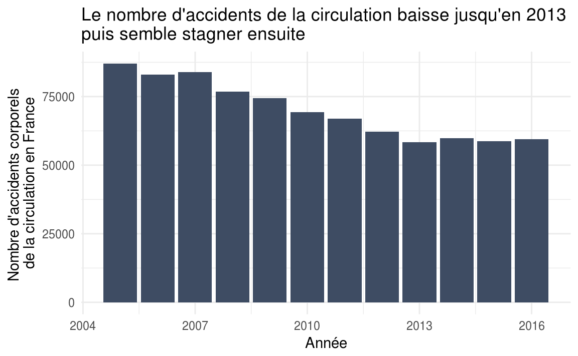
accidentsSpecifications %>%
  ggplot(aes(x = year)) +
  geom_bar(fill = "#3e4c63") +
  labs(
    title = "Le nombre d'accidents de la circulation baisse jusqu'en 2013 \npuis semble stagner ensuite",
    x = "Année",
    y = "Nombre d'accidents corporels de la circulation en France"
  ) +
  theme_minimal()
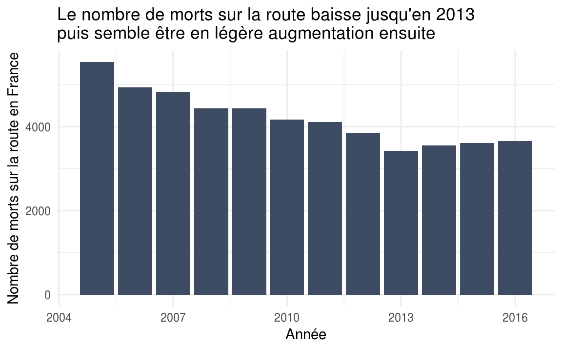
accidentsUsers %>%
  filter(grav == 2) %>%
  ggplot(aes(x = year)) +
  geom_bar(fill = "#3e4c63") +
  labs(
    title = "Le nombre de morts sur la route baisse jusqu'en 2013 \npuis semble être en légère augmentation ensuite",
    x = "Année",
    y = "Nombre de morts sur la route en France"
  ) +
  theme_minimal()
accidentsSpecifications %>%
  group_by(date) %>%
  summarize(nb_accidents = n()) %>%
  mutate(date = update(date, year = 2017)) %>%
  group_by(date) %>%
  summarize(nb_accidents = mean(nb_accidents)) %>%
  ggplot(aes(x = date, y = nb_accidents, group = 1)) +
  geom_line(color = "#3e4c63") +
  labs(
    title = "Il y a moins d'accidents en août et pendant les fêtes de fin d'année",
    x = "Jour de l'année",
    y = "Nombre moyen d'accidents par jour"
  ) +
  theme_minimal() +
  scale_x_date(date_labels = "%B")
top10 <- accidentsSpecifications %>%
  group_by(date) %>%
  summarize(nb_accidents = n()) %>%
  mutate(date = update(date, year = 2017)) %>%
  group_by(date) %>%
  summarize(nb_accidents = mean(nb_accidents)) %>%
  arrange(nb_accidents) %>%
  filter(row_number() <= 10)
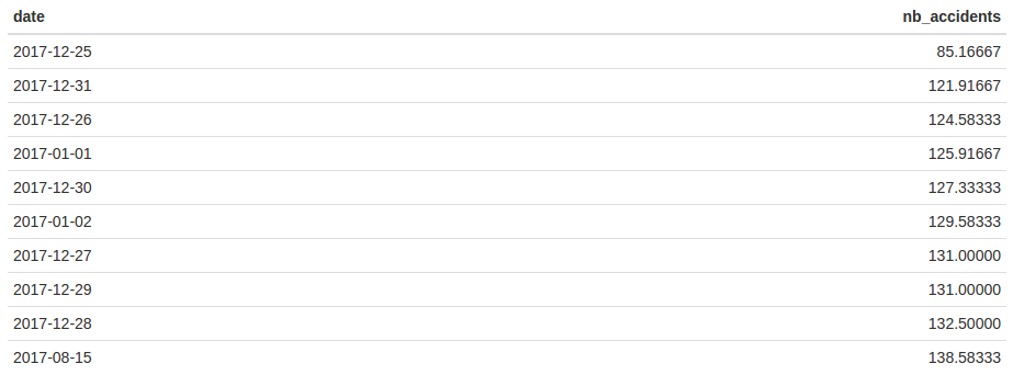
Top 10 of the days of the year with, on average, the fewest accidents
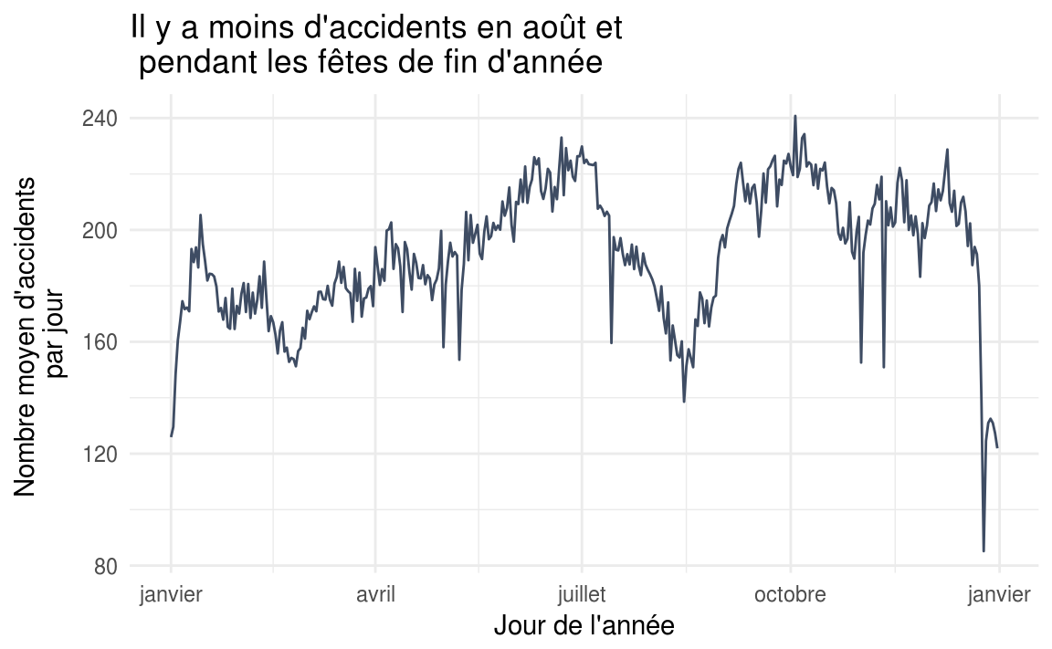
Careful, this does not necessarily mean that road users are more careful during the holidays. We can assume in particular that there is generally less traffic during the month of August than during the rest of the year, and that is despite the peaks of holiday departures and returns. We can see that this is indeed the case in Paris, if we are to believe this article published on francebleu.fr: “Paris au mois d’août : ça roule mieux” (“Paris in August: the traffic flows better”). To confirm this point, we would however have to rely on a proper study, or for example use statistics from applications like Waze, if they were ever made available.
It is also interesting to look at this curve by département. We can see for instance that in summer, the number of accidents drops noticeably in Paris while over the same period it rises in the Var.
Accidents and deaths by hour of the day and by day of the week #
dayHours <- c(7:23, 0:6)
dayHoursLabels <- c('07', '08', '09', '10', '11', '12', '13', '14', '15', '16', '17', '18', '19', '20', '21', '22', '23', '00', '01', '02', '03', '04', '05', '06')

accidentsSpecifications %>%
  mutate(datetime = update(datetime, minutes = 0, seconds = 0)) %>%
  group_by(datetime) %>%
  summarize(nb_accidents = n()) %>%
  mutate(hour = hour(datetime)) %>%
  group_by(hour) %>%
  summarize(nb_accidents = mean(nb_accidents)) %>%
  mutate(hour = factor(hour, levels = dayHours, labels = dayHoursLabels)) %>%
  ggplot(aes(x = hour, y = nb_accidents, group = 1)) +
  geom_col(fill = "#3e4c63") +
  labs(
    title = "Il y a plus d'accidents de la circulation entre 17h et 19h",
    x = "Heure de la journée",
    y = "Nombre moyen d'accidents par heure"
  ) +
  theme_minimal()
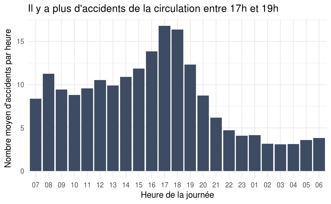
We see a first peak between 8am and 10am, then a second, much more pronounced one between 5pm and 7pm. We can assume that these peaks correspond to the trips to and from work, during which the number of vehicles on the road is generally much higher than during the rest of the day.
It would be interesting to understand why the evening peak is much bigger than the morning one.
inner_join(
  accidentsUsers %>%
    filter(grav == 2) %>%
    group_by(hour) %>%
    summarize(nb_deathlyaccidents = n_distinct(Num_Acc)),
  accidentsSpecifications %>%
    group_by(hour) %>%
    summarize(nb_accidents = n_distinct(Num_Acc)),
  by = 'hour'
) %>%
  mutate(deathly_accidents_percentage = 100 * (nb_deathlyaccidents / nb_accidents)) %>%
  mutate(hour = factor(hour, levels = dayHours, labels = dayHoursLabels)) %>%
  ggplot(aes(x = hour, y = deathly_accidents_percentage, group = 1)) +
  geom_col(fill = "#3e4c63") +
  labs(
    title = "Le pourcentage d'accidents mortels connait un pic entre minuit et 7h",
    x = "Heure de la journée",
    y = "Pourcentage d'accidents mortels"
  ) +
  theme_minimal()
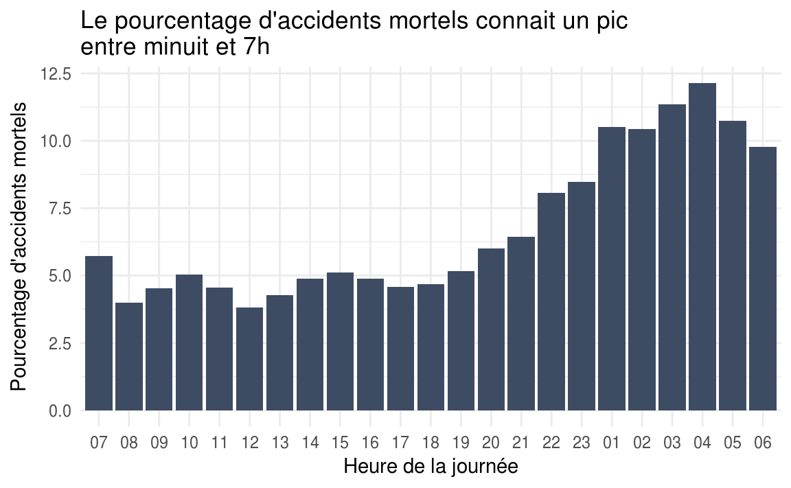
The rate of fatal accidents peaks between midnight and 7am. Here too, we can put forward a few hypotheses: less visibility, tiredness, a time of day more likely to involve risky behaviour (coming back from a night out, etc).
inner_join(
  accidentsUsers %>%
    filter(grav == 2) %>%
    group_by(wday) %>%
   summarize(nb_deathly_accidents = n_distinct(Num_Acc)),
  accidentsSpecifications %>%
    group_by(wday) %>%
    summarize(nb_accidents = n()),
  by = 'wday'
) %>%
  mutate(wday = factor(wday, levels=c('Mon', 'Tues', 'Wed', 'Thurs', 'Fri', 'Sat', 'Sun'), labels =  c('Lundi', 'Mardi', 'Mercredi', 'Jeudi', 'Vendredi', 'Samedi', 'Dimanche'))) %>%
  mutate(deathly_accidents_percentage = 100 * (nb_deathly_accidents / nb_accidents)) %>%
  ggplot(aes(x = wday, y = deathly_accidents_percentage, group = 1)) +
  geom_col(fill = "#3e4c63") +
  labs(
    title = "Le pourcentage d'accidents mortels est plus important le week-end",
    x = "Jour de la semaine",
    y = "Pourcentage d'accidents mortels"
  ) +
  theme_minimal()
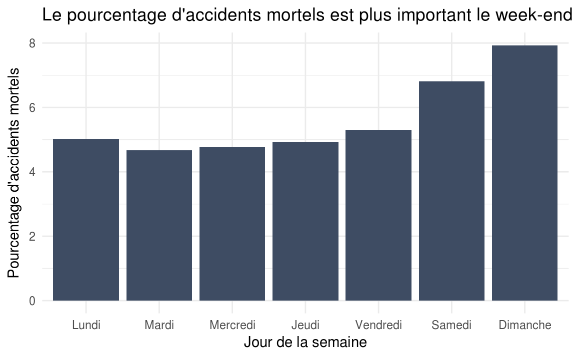
Here too, we can imagine that the higher rate of fatal accidents during the weekend is partly due to the fact that this period of the week is more likely to involve risky behaviour (coming back from a night out, etc), but there are probably other factors at play.
The charts to take with a pinch of salt: accidents by age and by gender #
accidentsUsers %>%
  filter(grav == 2) %>%
  mutate(age = year(now()) - an_nais) %>%
  group_by(year, age) %>%
  summarise(accidenteds_number = n()) %>%
  group_by(age) %>%
  summarize(accidenteds_number = mean(accidenteds_number)) %>%
  ggplot(aes(x = age, y = accidenteds_number, group = 1)) +
  geom_vline(aes(xintercept = 25), colour = "#ccd7ea", size = 1) +
  geom_vline(aes(xintercept = 35), size = 1, colour = "#ccd7ea") +
  geom_line(color = "#3e4c63", size = 1.5) +
  labs(
    title = "Il y a le plus de décès sur la route dans la tranche des 25 - 30 ans",
    x = "Age",
    y = "Nombre annuel moyen de morts sur la route en fonction de l'age"
  ) +
  theme_minimal()
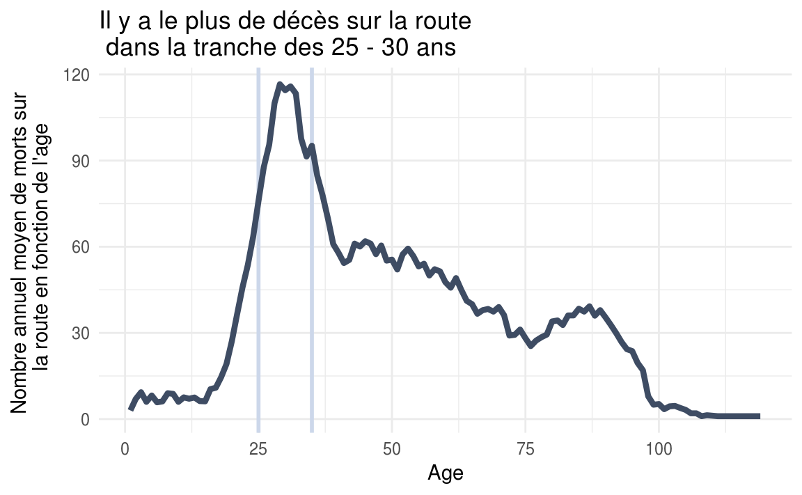
The average number of deaths is higher in the 25-30 age group. Careful, that does not mean that this group is more at risk than the others. We can assume that the users in this age group are simply the ones most present on the road, hence the higher number of accidents for that group.
accidentsUsers %>%
  filter(catu == 1) %>%
  group_by(year, sexe) %>%
  summarize(accidenteds_number = n()) %>%
  group_by(sexe) %>%
  summarize(accidenteds_number = mean(accidenteds_number)) %>%
  mutate(sexe = factor(sexe, labels = c('Homme', 'Femme'))) %>%
  ggplot(aes(x = sexe, fill = sexe, y = accidenteds_number)) +
  geom_col() +
  scale_fill_manual(values = c("#2b8cbe", "#fa9fb5")) +
  guides(fill=FALSE) +
  labs(
    title = "Il y a moins d'accidents impliquant des femmes que des hommes",
    x = "Sexe",
    y = "Nombre annuel moyen d'accidents de la route par sexe"
  ) +
  theme_minimal()
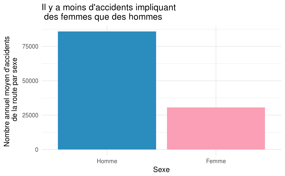
Here again, careful, that does not mean that women drive better than men. Men are perhaps simply more present on the road than women overall. Some information on the subject can be found in particular in a 2013 survey by the Observatoire de la mobilité en Île-de-France, the mobility observatory for the Paris region.
A few maps … #
deathsData <- accidentsSpecifications %>%
  inner_join(accidentsUsers) %>%
  filter(grav == 2) %>%
  filter(!is.na(lat) & !is.na(long) & lat != 0 & long != 0) %>%
  mutate(lat = lat / 100000, long = long / 100000) %>%
  filter(lat > 40 & long < 15) %>%
  select(Num_Acc, lat, long)

ggplot(deathsData) +
  geom_polygon(data = map_data("france"), aes(x=long, y = lat, group = group), fill = "#e5e5e5") +
  geom_point(deathsData, mapping = aes(x = long, y = lat), size = 0.1, color = "#3e4c63", alpha = 0.3) +
  coord_fixed(1.3) +
    labs(
    title = "Personnes décédées à la suite d'un accident de la circulation"
  ) +
  theme_void()
bikeAccidentsData <- accidentsSpecifications %>%
  inner_join(accidentsVehicles) %>%
  inner_join(accidentsUsers) %>%
  filter(catv == '01') %>%
  filter(dep == '750') %>%
  mutate(lat = lat / 100000, long = long / 100000) %>%
  mutate(grav = factor(grav, levels = c(1,4,3,2), labels = c('Indemne', 'Blessé léger', 'Blessé hospitalisé', 'Tué'))) %>%
  select(Num_Acc, grav, lat, long)

ggmap(get_map(location = c(lon = 2.3488, lat = 48.8534), source = "google", zoom = 12)) +
  geom_point(data = bikeAccidentsData, mapping = aes(x = long, y = lat, fill = grav), colour="#000000", size = 3, pch=21) +
  labs(
    title = "Les accidents de vélo à Paris selon la gravité",
    fill = "Gravité"
  ) +
  theme_void() +
  scale_fill_brewer(palette = "Reds", na.value = "#bababa") +
  theme(legend.position="bottom")
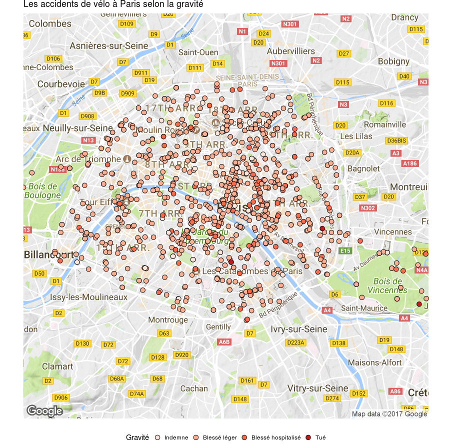
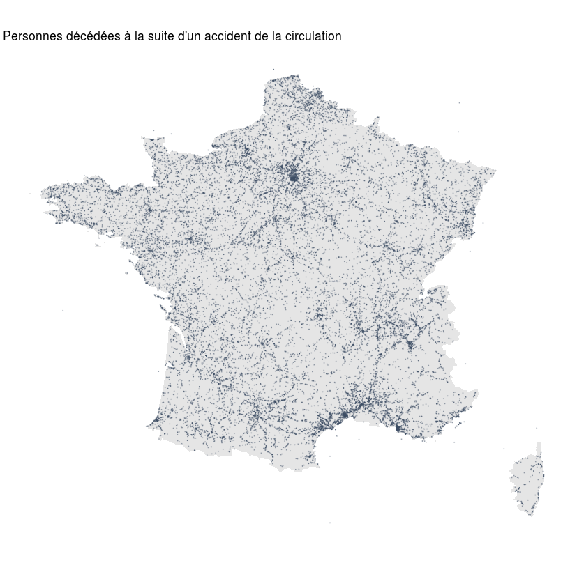
The first map is of very little interest, since the areas with the most accidents are of course the major roads and the big cities. It can be more interesting to visualise road accidents by town, or even by neighbourhood, to identify dangerous roads for example.
Impact points on cars #
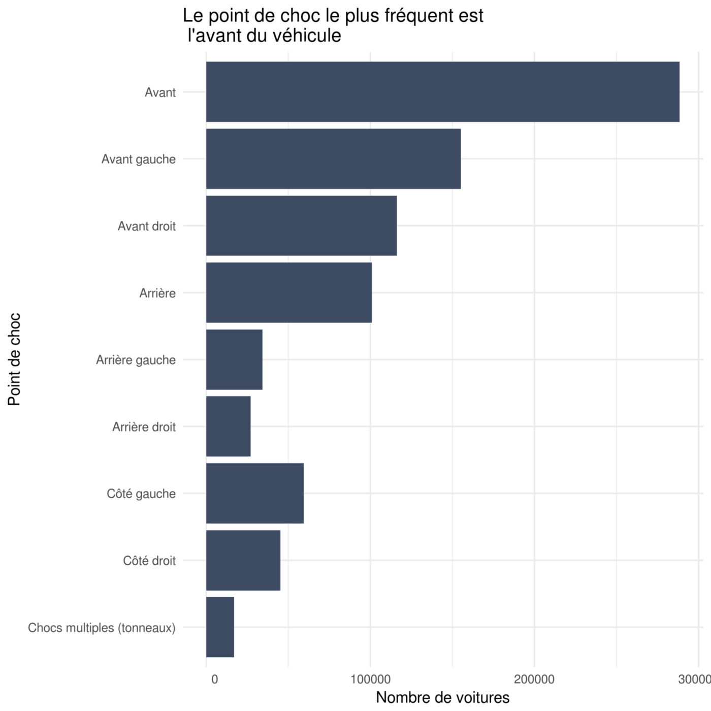
accidentsVehicles %>%
  filter(catv == '07') %>%
  mutate(choc = factor(choc, levels = rev(c(1,3,2,4,6,5,8,7,9)), labels = rev(c('Avant','Avant gauche','Avant droit','Arrière','Arrière gauche','Arrière droit','Côté gauche','Côté droit','Chocs multiples (tonneaux)')))) %>%
  group_by(choc) %>%
  summarize(accidenteds_number = n()) %>%
  filter(!is.na(choc)) %>%
  ggplot(aes(x = choc, y = accidenteds_number)) +
  geom_col(fill = "#3e4c63") +
  labs(
    title = "Le point de choc le plus fréquent est \n l\'avant du véhicule",
    x = "Point de choc",
    y = "Nombre de voitures"
  ) +
  theme_minimal() +
  coord_flip()