(An attempt at) Visualising Rennes climate data since 1999 with R
This post was originally published in French on 12 October 2017.
After coming across the infographic “Rain patterns in Hong Kong, Some of the wettest and driest days since 1990” from the South China Morning Post, I tried to produce a similar visualisation of climate data, but applied to the city of Rennes. The source code is available on Github.
Climate data is available under the Licence Ouverte Etalab (the French open government licence) from Météo-France, the national weather service, through monthly climate bulletins. Unfortunately, only monthly summaries are available (average temperatures, cumulative rainfall, etc). No daily data to be found, then (Météo-France, if you are reading this …).
In the R code below, the data has already been cleaned, structured and stored beforehand in an RDF triplestore, which we can therefore query directly in SPARQL with the {SPARQL} package.
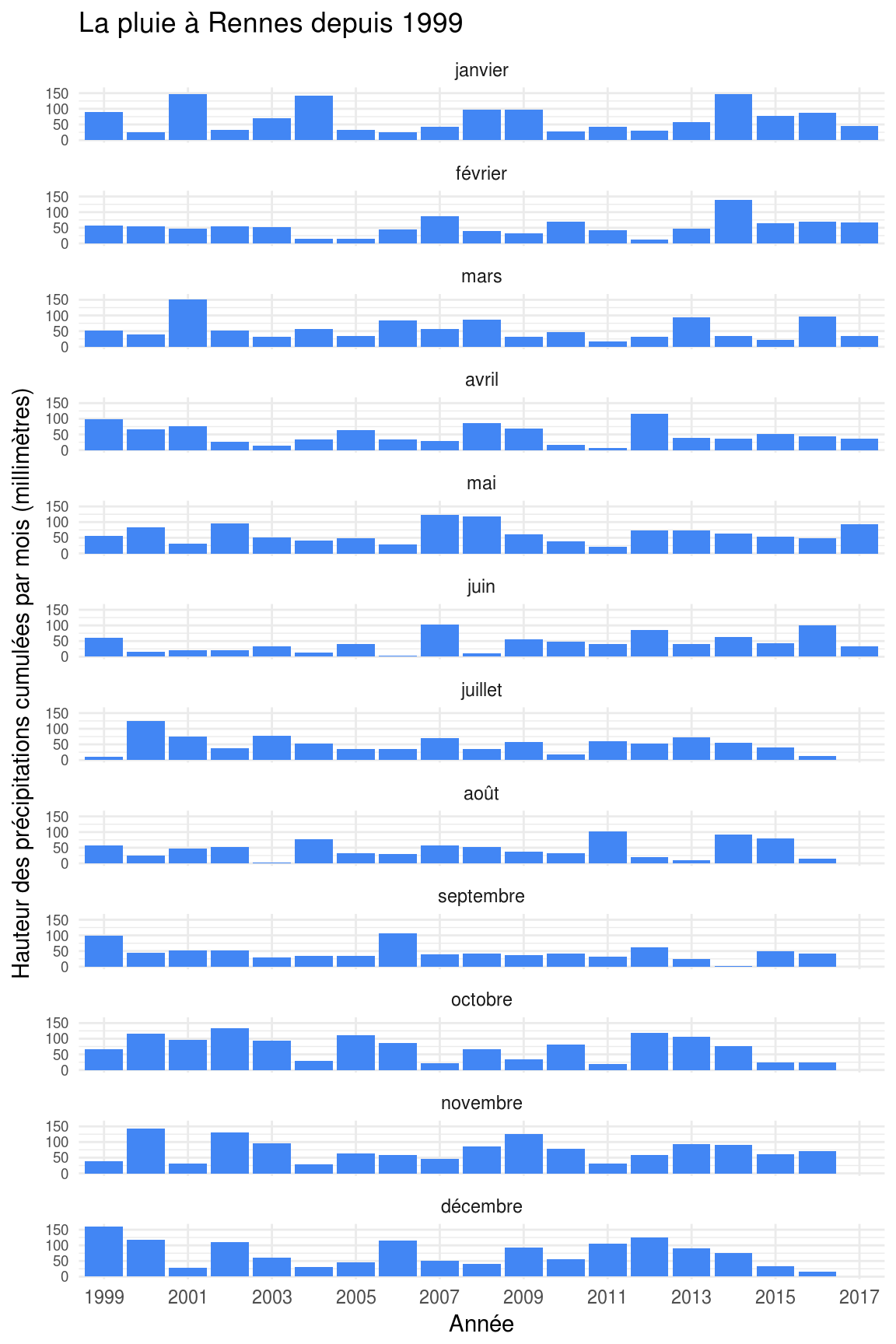
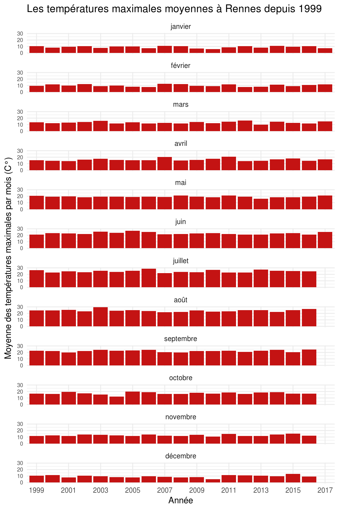
As I only have monthly data on hand, I tried to visualise a few variables with the months of the year on the x axis (from January to December) and the years on the y axis (from 1999 to 2017), hoping to bring out “exceptional” months (in terms of rain, sunshine, etc). Unfortunately, as I suspected, the result is not very convincing in the end and we do not learn much. Since the data is summarised by month, it ends up too “smoothed”. Daily data would have made it possible to bring out peaks of heat or rain that lasted a few days.
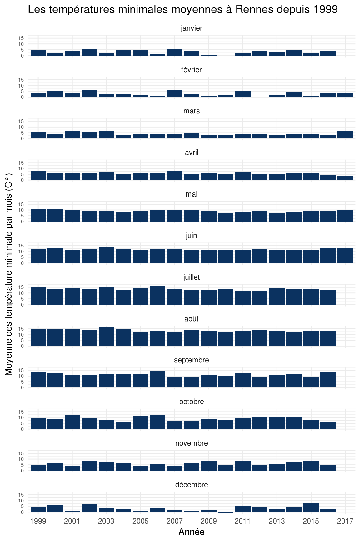
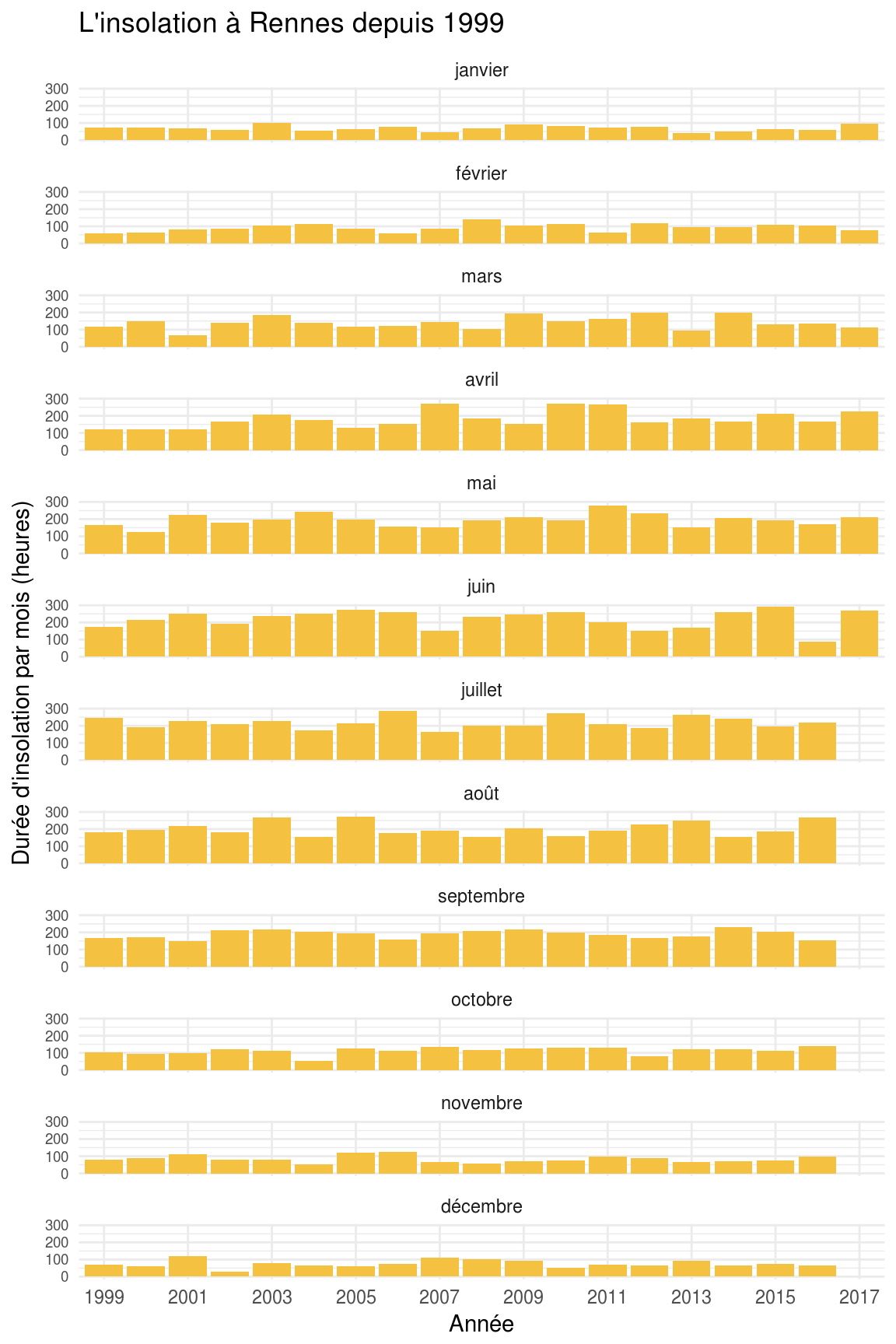
Even so, a few “exceptions” are still easy to spot. For example, June 2016 was particularly poor in sunshine, with a total of only 90 hours. See for instance the article from Le Télégramme on the subject: Bretagne. Mais où est passé le soleil ? (“Brittany. Where has the sun gone?”). You can also see that January 2017 was particularly cold, with an average minimum temperature of -0.3°. See the Télégramme article on that one.
Note: the goal was simply to have an excuse to carry on learning R, the R Markdown format and a few packages by practising. The relevance of this mini-infographic could of course be improved with daily data, by adding some interactivity, for instance by letting the user compare the data with that of other weather stations, by using other variables, etc.
endpoint <- "" # Configure your triplestore endpoint here

query <- "
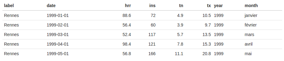
SELECT ?label xsd:string(?date) as ?date ?hrr ?ins ?tn ?tx WHERE {
  ?weatherReport a weather:Report ;
    weather:linkedToStation ?station ;
    weather:reportDate ?date ;
    weather:hrrMm ?hrr ;
    weather:instH ?ins ;
    weather:tnC ?tn ;
    weather:txC ?tx .
  ?station rdfs:label 'Rennes' ;
    rdfs:label ?label .
}
"

results <- SPARQL(endpoint, query)$results %>%
  as.tibble() %>%
  mutate(
    year = factor(year(date)),
    month = factor(month(date), labels = c("janvier", "février", "mars", "avril", "mai", "juin", "juillet", "août", "septembre", "octobre", "novembre", "décembre"))
  )
results %>%
  ggplot(aes(x = year, y = hrr, group = 1)) +
  geom_col(fill = "#4286f4") +
  labs(
    title = "La pluie à Rennes depuis 1999",
    x = "Année",
    y = "Hauteur des précipitations cumulées par mois (millimètres)"
  ) +
  facet_wrap(~month, ncol = 1) +
  scale_x_discrete(breaks=seq(1999, 2017, 2)) +
  theme_minimal() +
  theme(axis.text.y = element_text(size = rel(0.8)))
results %>%
  ggplot(aes(x = year, y = ins, group = 1)) +
  geom_col(fill = "#f4c141") +
  labs(
    title = "L'insolation à Rennes depuis 1999",
    x = "Année",
    y = "Durée d'insolation par mois (heures)"
  ) +
  facet_wrap(~month, ncol = 1) +
  scale_x_discrete(breaks=seq(1999, 2017, 2)) +
  theme_minimal() +
  theme(axis.text.y = element_text(size = rel(0.8)))
results %>%
  ggplot(aes(x = year, y = tx, group = 1)) +
  geom_col(fill = "#c41313") +
  labs(
    title = "Les températures maximales moyennes à Rennes depuis 1999",
    x = "Année",
    y = "Moyenne des températures maximales par mois (C°)"
  ) +
  facet_wrap(~month, ncol = 1) +
  scale_x_discrete(breaks=seq(1999, 2017, 2)) +
  theme_minimal() +
  theme(axis.text.y = element_text(size = rel(0.8)))
results %>%
  ggplot(aes(x = year, y = tn, group = 1)) +
  geom_col(fill = "#0b3260") +
  labs(
    title = "Les températures minimales moyennes à Rennes depuis 1999",
    x = "Année",
    y = "Moyenne des température minimale par mois (C°)"
  ) +
  facet_wrap(~month, ncol = 1) +
  scale_x_discrete(breaks=seq(1999, 2017, 2)) +
  theme_minimal() +
  theme(axis.text.y = element_text(size = rel(0.7)))