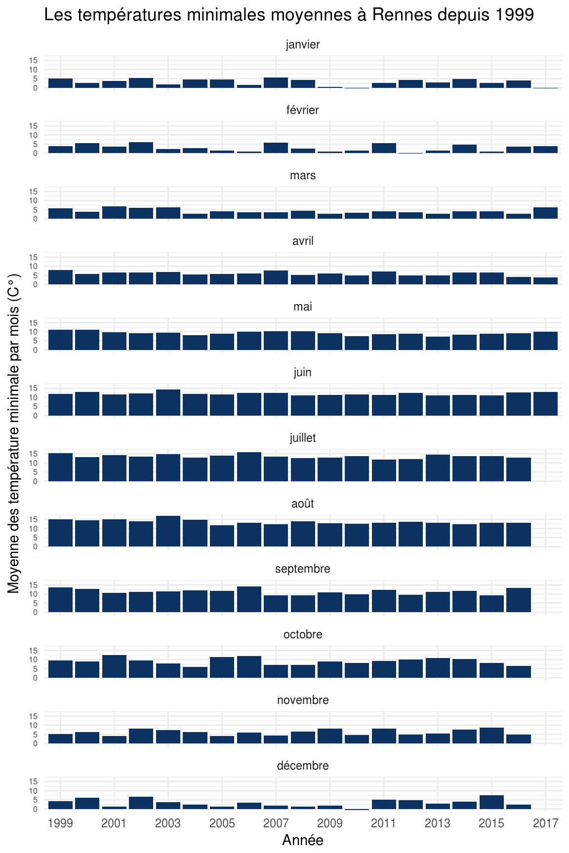
Profiling tools allow you to collect detailed performance metrics from a code execution in order to further analyse them through a visualization tool. The main purpose of this kind of practices is to ease the find of performance bottlenecks in your code. In the PHP ecosystem, there are several tools available to perform code profiling.
We will focus on Xdebug in this post, and I may release a second post about Blackfire later. In the meantime, feel free to dig into the other available profiling tools.
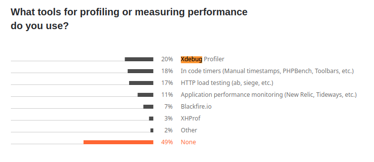
We can learn from the insightful survey from JetBrains released in 2021 that Xdebug is the most popular tool with 20% of usage among all the other tools to perform code profiling or performance measuring (which also include tools like APM or HTTP load bench). Blackfire reaches a solid 7% of usage. The survey highlights that there is also plenty of developers - 18% - who collect their performance metrics right from the code, by setting manual timestamps for instance. It can obviously be an effective solution if you just need to profile a known-beforehand part of your code.
Tools used for profiling or measuring performance
Before we can use profiling tools, we need to set up a minimalistic PHP environment with a sample application to profile. For the sake of simplicity, We will rely on docker-compose to achieve this first step - assuming you are already familiar with docker containers. The basic setup is available in this GitHub repository, and you are free to clone it to in order to do your own experiments. We will bootstrap a Symfony application to have something on which perform code profiling. Let's start with the basic docker-compose.yaml configuration file :
version: '3.7'
services:
codeprofiling-php-fpm:
container_name: codeprofiling-php-fpm
build: php-fpm
volumes:
- ./:/var/www/codeprofiling
codeprofiling-nginx:
container_name: codeprofiling-nginx
image: nginx
ports:
- "8080:80"
volumes:
- ./:/var/www/codeprofiling
- ./nginx/codeprofiling.conf:/etc/nginx/conf.d/default.conf
Here, we define the only two services we need for our profiling purpose. The php-fpm service is built from a custom image defined in a Dockerfile that we will see right after. The Nginx service acts as our web server and allows us to query our PHP application through HTTP on the port 8080. Nginx requires a bit of additional configuration which is brought by the file codeprofiling.conf
. Since this file is not very relevant for our profiling concern, we will skip it, but you still can take a look to the one I've set in the GitHub repository. You will notice in the configuration that Nginx communicates with php-fpm through the port 9000 which is the default port exposed by the php-fpm docker image. That's all for the docker-compose file for now, let's dive into the Dockerfile for the php-fpm service !
FROM php:8.1-fpm
ARG userid
ARG groupid
RUN apt-get update -yqq \
&& apt-get install -yqq git unzip
COPY --from=composer:latest /usr/bin/composer /usr/bin/composer
RUN curl -sS https://get.symfony.com/cli/installer | bash \
&& mv /root/.symfony/bin/symfony /usr/local/bin/symfony
RUN groupadd -g $userid myuser \
&& useradd -m -u $userid -g $groupid myuser
USER myuser
RUN git config --global user.email "example@example.com" \
&& git config --global user.name "Example"
WORKDIR /var/www/codeprofiling
The Dockerfile extends the PHP 8.1 basic image to add some extra steps : install basic tools like git and unzip, install Composer and Symfony CLI tools, create a user who will have the same UID and GID than the current host user. The initialization of GIT email and username is required by Symfony CLI tool in order to install the framework without any error.
Now that our docker-compose.yaml and Dockerfile files are set, we can finally build and run our services :
docker-compose build --build-arg userid=$(id -g) --build-arg groupid=$(id -u)
docker-compose up -d
The next step is about installing a blank Symfony application within the app/
subdirectory. Thanks to the Symfony CLI tool, it can be achieved by running a single command :
docker-compose exec -T codeprofiling-php-fpm bash -c "symfony new app --webapp"
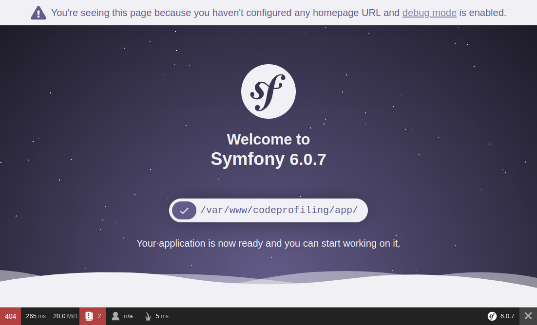
If you now query http://localhost:8080, you should get this introduction page :
There is no need to set up some kind of "hello world" page with a custom route and a controller since we are able to analyze the execution of this already-working introduction page in depth with Xdebug. Now that everything is up, we can move on to the next step and install xDebug !
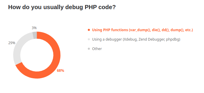
Xdebug is a widespread PHP extension of which the first version has been released in 2002. It's mostly used for its advanced debugging feature which provides step by step execution. According to the jetbrains survey, Xdebug is used by roughly 30% of developers who need to perform debug tasks. Most of us are actually var_dump() users. Looking at these figures, I guess there are even less developers who use Xdebug for code profiling purpose, although it's really a convenient tool !
Xdebug provides three modes that can be enabled independently. The debug mode allows you to run your code step by step by setting breakpoints. The develop mode brings more user-friendly var_dump()
output and errors. Last but not least, Xdebug provides a profile
mode that allows you to - you guessed it - analyze in depth the performance of your code.
If you want to jump directly to the final version of the PHP environment with xdebug ready-to-use, you can take a look at the "xdebug" branch from the GitHub repository. The installation of Xdebug PHP extension is pretty straightforward and can be achieved by adding this small bunch of lines to the Dockerfile :
RUN pecl install xdebug \
&& docker-php-ext-enable xdebug \
&& echo "xdebug.mode=debug,develop,profile" >> /usr/local/etc/php/conf.d/docker-php-ext-xdebug.ini \
&& echo "xdebug.start_with_request=trigger" >> /usr/local/etc/php/conf.d/docker-php-ext-xdebug.ini \
&& echo "xdebug.client_host=host.docker.internal" >> /usr/local/etc/php/conf.d/docker-php-ext-xdebug.ini \
&& echo "xdebug.output_dir=/var/www/codeprofiling/profiles" >> /usr/local/etc/php/conf.d/docker-php-ext-xdebug.ini
To clarify, we first install the Xdebug PHP extension through PECL before enabling it. The following lines aim to write the basic configuration into the file docker-php-ext-xdebug.ini
.
In order to allow us to test all the features offered by Xdebug, we enable both the debug, develop and profile modes but since we will only use the 'profile' mode in this tutorial, we could have skipped the 'debug' and 'develop' ones. Pro-tip : if you want to collect very accurate performance metrics, you should consider disabling the "debug" mode as this mode adds overhead at runtime. In the same way, you should disable the garbage collector (see zend.enable_gc) to get more accurate memory usage data.
We set the xdebug.start_with_request option to trigger
in order to run the profiling when a specific trigger is present in the request. Thus, Xdebug can be started by setting either a specific GET or POST variable, or even an HTTP cookie, we'll see it in action in the next part.
Setting xdebug.client_host isn't formally required for our profiling purpose. Still, if you want to take advantage from the debug mode, it's worth to be set. This option allows Xdebug to know the host on which it needs to establish a connection with your IDE. The default port for this connection is 9003
, so you should ensure that your IDE listen the same port if you want to perform debugging.
The last xdebug.output_dir option is the most important one to make the profiling mode work. It allows you to set the directory in which the profiling files will be saved for further analysis. Xdebug actually just write a callgrind-formatted file, then that's up to you to open it with an appropriate tool. Since we run PHP into a docker container, this directory should be accessible both from the container and the host. That's why a directory within the project is a suitable location, but we could also have created a dedicated docker volume for instance. Besides, you need to ensure the proper rights are set so the PHP process can write into this directory.
Another last thing to add in the docker-compose.yaml file is the definition of the extra host host.docker.internal
we used in the Dockerfile. As said before, this is not required for profiling mode but only for debug.
extra_hosts:
- "host.docker.internal:host-gateway"
That's it, now we are ready to perform our first code profiling !
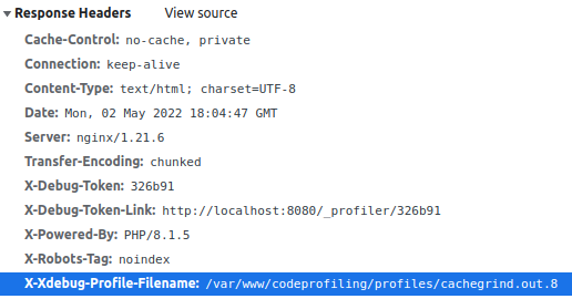
If you remember, a specific trigger must be conveyed to the request to tell Xdebug to start the profiling. The trigger is XDEBUG_TRIGGER=StartProfileForMe
, and it can be set either by a GET variable, a POST variable or even an HTTP cookie. So let's start a profiling by requesting http://localhost:8080?XDEBUG_TRIGGER=StartProfileForMe. If Xdebug is correctly configured, you should find an HTTP header in the response that points out where the profile file has been saved :
X-Xdebug-Profile-Filename: /var/www/codeprofiling/profiles/cachegrind.out.x
This file contains a text-formatted call graph of the functions call stack involved to render the page along with all the figures regarding execution time and memory usage for each call.
If you use PHPStorm, you're lucky because this IDE already includes a tool that allows you to visualize this kind of callgrind files. However, it's really a basic tool that brings only tabular views of the data. If you want a more advanced and user-friendly tool with a graphical view of the data, you should definitely head for KCachegrind.
Starting code profiling for command line applications is as simple as for web apps. Actually Xdebug can also be started by setting the trigger variable as an environment variable. So let's execute bash on the php-fpm service :
docker exec -it codeprofiling-php-fpm bash
We could for instance execute a command from the symfony console. We just need to add the XDEBUG_TRIGGER
environment beforehand to start Xdebug along with the command. The new profile file should then be created within the profiles' directory.
XDEBUG_TRIGGER=StartProfileForMe php app/bin/console about
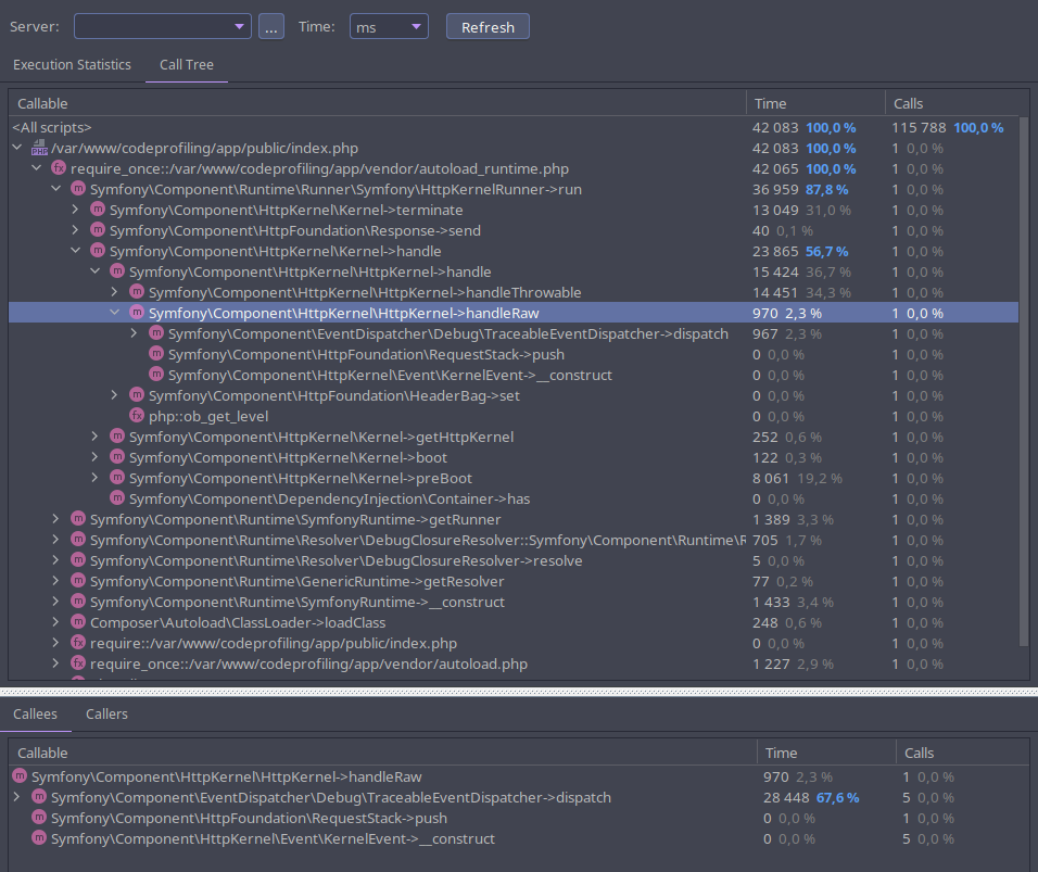
Simply go to Tools
> Analyse Xdebug Profiler Snapshot
and open the cachegrind.out.x
file written by Xdebug. Here we are ! We can now explore all the performance metrics gathered by Xdebug. Within the "execution statistics" tab, we can easily list the most time or memory consuming calls, spot the most called functions, browse the callees and the callers of a specific function, etc.
Within the "call tree" tab, we can browse the execution graph by unfolding the calls with in a top-down approach.
KCachegrind is old-school tool but a way more comprehensive than the built-in analyzer from PHPStorm. It provides two useful graphical views of the call stack that you can easily browse. First, a tree graph shows how the calls are related between them. On the other hand, a tree map shows the call hierarchy of the application with rectangles sized after a chosen metric value.
A search form will help you find for any specific call by function name. Moreover, you can group calls by classname or file to inspect the data from a different angle.
KCachegrind is available for Linux based operating systems. If you are using Mac OS X or Windows, you'll need to install Qcachegrind instead which is basically the same tool.
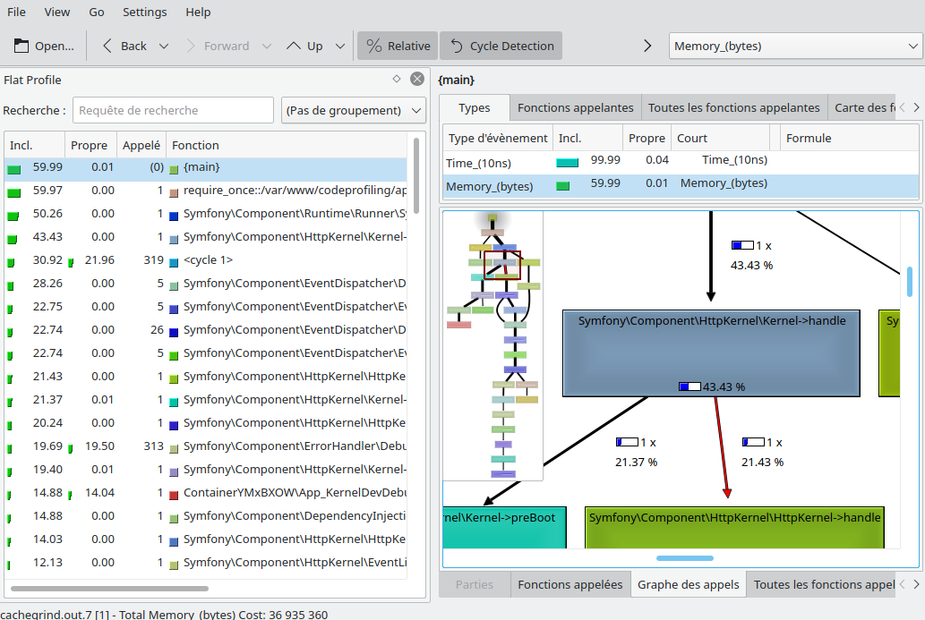
Browsing the tree graph
Would you want to gather more insights on Kcachegrind abilities before jumping in ? Here is great a video tutorial from Derick Rethans, the father of Xdebug, that explains more in depth all the data shown in the different tabs of the tool :
Now is the time for you to perform some profiling analysis on your own to become more familiar with the tool !
You are now able to easily catch performance bottlenecks in your code thanks to Xdebug profile mode. I hope this little introduction has helped you to bring Xdebug into your real projects. Feel free to share the tools or the tricks you use to perform code profiling or to analyse the profiles. If you need deeper details on how xdebug works and all the options available, go to the Xdebug documentation. In a latter time, I may release another post focused on Blackfire. You should also consider this solution if you haven't yet. Blackfire is an awesome platform to get a detailed view of code performance through a modern dashboard. Besides, Blackfire goes far beyond just code profiling by providing a bunch of APM-like features.
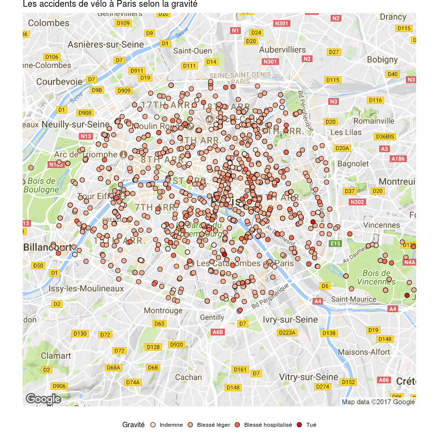
]]>Now, it's 2022, the library still works like a charm and is downloaded 95,000 times a month according to NPM statistics. However, I haven't maintained it for quite a lot of time. I didn't push any relevant commit on the repository since 2018, and I barely answer to users' issues on GitHub. Why ? I think the main reason is as simple as a lack of time. Working alone on an Open Source project that got some users require a large amount of time because it comes with a bunch of other tasks that goes beyond of simply adding new features. You not only have to make the project evolve, but you also have to take care of the project community : answering GitHub issues and questions sent by emails, reviewing pull requests, discussing and working on new features requested by users are few of the additional time-consuming tasks. Furthermore, at some point, I wanted to use my free time to focus on some other projects and learnings.
Mapael is a jQuery plugin built on top of raphael.js that allows you to display dynamic vector maps. For example, you can display a map of the world with areas filled with a color alongside with a legend (otherwise named a choropleth map). You can also build more advanced and highly customizable visualizations by plotting cities with their geo coordinates, drawing links between them and enable some features such as multiple legends, zooming & panning, etc. Feel free to take a look at the demos on the documentation page to see Mapael in action.
A Map built with Mapael
I have not so much data about Mapael usage. The only data come from Github and NPM. At the end of January 2022, there are :
Since the beginning of the journey, Mapael has received 995 stars and has been forked 200 times. jquery-mapael and mapael-maps repositories total 196 closed pull requests and 148 closed issues.
See more on npm-stat
We can see on the NPM chart above that the number of downloads per month remains at a high level and haven't stopped growing since 2019. This is quite surprising as I haven't published any new release since the beginning of 2018 ! jQuery seems to follow the same growing trend of downloads per month through NPM, so maybe jQuery and Mapael are not dead yet. So what to do with an unmaintained tool with obsolete dependencies but that is still used ?
To my mind, jQuery Mapael as such is doomed to a certain death. Mapael is closely bound to some obsolete or near-obsolete dependencies. Mapael is built on top of Raphael.js of which the last version has been released 3 years ago. Mapael is also tightly coupled to jQuery, and although jQuery has done a great job during a long time, it will probably disappear in the years to come. Furthermore, it would be now quite hard to add new features on top of the current code base. Indeed, the structure and the API became quite messy over time (Side note : I'm not very proud of how the code I wrote some years algo looks now).
For all the reasons above, I think the project would greatly benefit from being completely rewritten in a more modular way, in modern JS, and providing a more structured API. This hypothetical "reboot" project surely couldn't be named "jQuery Mapael" anymore as it would be a brand-new project. Anyway it was of course a great experience to launch and maintain such an Open Source project during several years !
So what's next for Mapael now ?
As I have taken my distance with the project since few years, there is no official maintainer now. For now, it appears there is still some usage of the library, so as a first step toward Mapael end, I will add a note on the readme file to explain that this project is not maintained by its author anymore. People or organizations who want to use Mapael anyway will be invited to contribute if they need some bugfixes or security fixes. Later, when the usage rate will be low enough, I will probably deprecate the project on NPM and archive the project on GitHub. I think archived projects can still be forked if needed.
In the meantime, there are already plenty of alternatives to build interactive maps with up-to-date javascript libraries : d3.js is for instance a decent one even if it's not only focused on maps.
Bivariate Choropleth built with d3.js
We have all heard about log4j and Faker.js stories few weeks ago. A lot of interesting discussions, debates and ideas emerged on social networks after these events about how to support or fund Open Source projects in a sustainable way. These stories highlighted an important issue of Open Source Software : how to keep providing high quality software for free ?
Many projects are directly supported by the companies which created them and many others come with some paid offers that provide more advanced features, cloud access, etc. I may be wrong, but I think most of the projects of this kind don't suffer a lot from fund issues as there is a business model behind.
However, many other projects are maintained only by one or maybe a few developers during their free time. It's often a challenge to keep these projects evolving in the long term, even if they reach some level of popularity. That's why it's important to not forget smaller Open Source projects when you consider bringing some contribution or funding to OSS. Anyway, I think companies that rely on Open Source Software should participate in return, either by granting time to allow developers to contribute or by funding some projects.
]]>Titanic training dataset overview
PassengerId | Survived | Pclass | Name | Sex | Age | SibSp | Parch | Ticket | Fare | Cabin | Embarked |
---|---|---|---|---|---|---|---|---|---|---|---|
1 | 0 | 3 | Braund, Mr. Owen Harris | male | 22 | 1 | 0 | A/5 21171 | 7.2500 | NA | S |
2 | 1 | 1 | Cumings, Mrs. John Bradley (Florence Briggs Thayer) | female | 38 | 1 | 0 | PC 17599 | 71.2833 | C85 | C |
3 | 1 | 3 | Heikkinen, Miss. Laina | female | 26 | 0 | 0 | STON/O2. 3101282 | 7.9250 | NA | S |
4 | 1 | 1 | Futrelle, Mrs. Jacques Heath (Lily May Peel) | female | 35 | 1 | 0 | 113803 | 53.1000 | C123 | S |
5 | 0 | 3 | Allen, Mr. William Henry | male | 35 | 0 | 0 | 373450 | 8.0500 | NA | S |
6 | 0 | 3 | Moran, Mr. James | male | NA | 0 | 0 | 330877 | 8.4583 | NA | Q |
7 | 0 | 1 | McCarthy, Mr. Timothy J | male | 54 | 0 | 0 | 17463 | 51.8625 | E46 | S |
8 | 0 | 3 | Palsson, Master. Gosta Leonard | male | 2 | 3 | 1 | 349909 | 21.0750 | NA | S |
9 | 1 | 3 | Johnson, Mrs. Oscar W (Elisabeth Vilhelmina Berg) | female | 27 | 0 | 2 | 347742 | 11.1333 | NA | S |
10 | 1 | 2 | Nasser, Mrs. Nicholas (Adele Achem) | female | 14 | 1 | 0 | 237736 | 30.0708 | NA | C |
At first sight
Missing values rate within variables
map_dbl(titanicTrainingDataset, function(x) mean(is.na(x)))
## PassengerId Survived Pclass Name Sex Age
## 0.000000000 0.000000000 0.000000000 0.000000000 0.000000000 0.198653199
## SibSp Parch Ticket Fare Cabin Embarked
## 0.000000000 0.000000000 0.000000000 0.000000000 0.771043771 0.002244669
The Age variable contains 19.86% of missing values and the Cabin one contains 77.1%. I will not use Cabin variable as there is too many missing values.
Import Titanic training dataset with proper col types for categorical variables
titanicTrainingDataset <- read_csv(
trainFile,
col_types = cols(
Survived = col_factor(0:1),
Pclass = col_factor(1:3),
Sex = col_factor(c("male", "female")),
Embarked = col_factor(c("C", "Q", "S"))
)
) %>%
filter(!is.na(Embarked)) %>%
mutate(Age = ifelse(is.na(Age), median(Age, na.rm = T), Age))
I filled the blank values for the Age variable with the median age and I have excluded rows that have no value for 'Embarked'.
Extract the passengers title from their name into a new dedicated variable
titanicTrainingDataset <- titanicTrainingDataset %>%
mutate(Title = as.factor(str_extract(Name, regex("([a-z]+\\.)", ignore_case = T))))
levels(titanicTrainingDataset$Title)
## [1] "Capt." "Col." "Countess." "Don." "Dr."
## [6] "Jonkheer." "Lady." "Major." "Master." "Miss."
## [11] "Mlle." "Mme." "Mr." "Mrs." "Ms."
## [16] "Rev." "Sir."
17 distinct titles have been extracted from the 'Name' variable.
summary(titanicTrainingDataset)
## PassengerId Survived Pclass Name Sex
## Min. : 1 0:549 1:214 Length:889 male :577
## 1st Qu.:224 1:340 2:184 Class :character female:312
## Median :446 3:491 Mode :character
## Mean :446
## 3rd Qu.:668
## Max. :891
##
## Age SibSp Parch Ticket
## Min. : 0.42 Min. :0.0000 Min. :0.0000 Length:889
## 1st Qu.:22.00 1st Qu.:0.0000 1st Qu.:0.0000 Class :character
## Median :28.00 Median :0.0000 Median :0.0000 Mode :character
## Mean :29.32 Mean :0.5242 Mean :0.3825
## 3rd Qu.:35.00 3rd Qu.:1.0000 3rd Qu.:0.0000
## Max. :80.00 Max. :8.0000 Max. :6.0000
##
## Fare Cabin Embarked Title
## Min. : 0.000 Length:889 C:168 Mr. :517
## 1st Qu.: 7.896 Class :character Q: 77 Miss. :181
## Median : 14.454 Mode :character S:644 Mrs. :124
## Mean : 32.097 Master.: 40
## 3rd Qu.: 31.000 Dr. : 7
## Max. :512.329 Rev. : 6
## (Other): 14
titanicTrainingDataset %>%
ggplot(aes(x = Survived)) +
geom_bar()
The following function will help me to visualize the response 'Survived' against each qualitative or quantitative potential predictors.
analysePredictorResponse <- function(data, predictor, response) {
if (is.factor(data[[predictor]])) {
ggplot(mapping = aes(data[[predictor]], fill = data[[response]])) +
geom_bar() +
labs(title = paste(predictor, "vs", response), x = predictor, fill = response)
} else {
chart1 <- ggplot(mapping = aes(data[[response]], data[[predictor]])) +
geom_boxplot() +
labs(title = paste(predictor, "vs", response), x = response, y = predictor)
chart2 <- ggplot(mapping = aes(x = data[[predictor]], , y = ..density.., colour = data[[response]])) +
geom_freqpoly(position = "dodge") +
labs(title = paste(predictor, "vs", response), colour = response, x = predictor)
grid.arrange(chart1, chart2)
}
}
Age vs Survived
analysePredictorResponse(titanicTrainingDataset, 'Age', 'Survived')
Sex vs Survived
analysePredictorResponse(titanicTrainingDataset, 'Sex', 'Survived')
titanicTrainingDataset %>%
group_by(Sex) %>%
summarize(SurvivedRatio = mean(Survived == 1))
## # A tibble: 2 x 2
## Sex SurvivedRatio
## <fct> <dbl>
## 1 male 0.189
## 2 female 0.740
It seems obvious that females have significantly more chance than males to survive.
Pclass vs Survived
analysePredictorResponse(titanicTrainingDataset, 'Pclass', 'Survived')
titanicTrainingDataset %>%
group_by(Pclass) %>%
summarize(SurvivedRatio = mean(Survived == 1))
## # A tibble: 3 x 2
## Pclass SurvivedRatio
## <fct> <dbl>
## 1 1 0.626
## 2 2 0.473
## 3 3 0.242
The more the passenger belongs to a wealthy class, more its likelihood to survive is high.
SibSp vs Survived
analysePredictorResponse(titanicTrainingDataset, 'SibSp', 'Survived')
The one who have no sibling seems to have higher chance to die than the one who have one sibling onboard.
Parch vs Survived
analysePredictorResponse(titanicTrainingDataset, 'Parch', 'Survived')
Similarly to SibSp, the one who have no parent nor children onboard seems to have higher chance to die than the one who have one parent or children.
Fare vs Survived
analysePredictorResponse(titanicTrainingDataset, 'Fare', 'Survived')
On average, higher is the fare, higher seems the likelihood to survive.
Embarked vs Survived
analysePredictorResponse(titanicTrainingDataset, 'Embarked', 'Survived')
titanicTrainingDataset %>%
group_by(Embarked) %>%
summarize(SurvivedRatio = mean(Survived == 1))
## # A tibble: 3 x 2
## Embarked SurvivedRatio
## <fct> <dbl>
## 1 C 0.554
## 2 Q 0.390
## 3 S 0.337
It seems there are some significant differences regarding the Survived rate depending on the port of Embarkation. Port C lead to 55.36% survive rate whereas port S lead to only 33.69%.
Pclass vs Fare
titanicTrainingDataset %>%
ggplot(mapping = aes(Pclass, Fare)) +
geom_boxplot()
** Embarked vs Pclass**
titanicTrainingDataset %>%
ggplot(mapping = aes(Embarked, fill = Pclass)) +
geom_bar()
What about the variable Title that I have extracted from the names ?
titanicTrainingDataset %>%
group_by(Title) %>%
summarize(SurvivedRatio = mean(Survived == 1)) %>%
arrange(SurvivedRatio) %>%
mutate(Title = factor(Title, levels = Title)) %>%
ggplot(aes(x = Title, y = SurvivedRatio)) +
geom_col() +
coord_flip()
Passengers title seems to provide interresting information for predicting the surviving ones. It seems we can refine this variable in order to reduce the number of levels. I Added a new categorical variable 'RefinedTitle' that split the passengers titles into 3 relevant levels :
titanicTrainingDataset <- titanicTrainingDataset %>% mutate(
RefinedTitle = factor(ifelse(Title %in% c('Capt.', 'Don', 'Jonkheer.', 'Rev.', 'Mr.'), 1,
ifelse(Title %in% c('Col.', 'Dr.', 'Major.', 'Master.'), 2, 3
)
))
)
Here is a first attempt of modelisation on the training dataset with most of the candidate predictors :
model <- glm(Survived ~ RefinedTitle + Pclass + SibSp + Embarked + Age + Sex + Parch, data = titanicTrainingDataset %>% filter(!is.na(Age)), family = binomial)
summary(model)
##
## Call:
## glm(formula = Survived ~ RefinedTitle + Pclass + SibSp + Embarked +
## Age + Sex + Parch, family = binomial, data = titanicTrainingDataset %>%
## filter(!is.na(Age)))
##
## Deviance Residuals:
## Min 1Q Median 3Q Max
## -2.3632 -0.5951 -0.3917 0.5812 2.5346
##
## Coefficients:
## Estimate Std. Error z value Pr(>|z|)
## (Intercept) 0.930213 0.393458 2.364 0.018069 *
## RefinedTitle2 2.556167 0.426595 5.992 2.07e-09 ***
## RefinedTitle3 0.473372 1.439032 0.329 0.742192
## Pclass2 -1.032744 0.282392 -3.657 0.000255 ***
## Pclass3 -2.163955 0.262944 -8.230 < 2e-16 ***
## SibSp -0.452722 0.114388 -3.958 7.56e-05 ***
## EmbarkedQ -0.274539 0.392170 -0.700 0.483895
## EmbarkedS -0.484066 0.244469 -1.980 0.047696 *
## Age -0.027045 0.008209 -3.294 0.000986 ***
## Sexfemale 2.672175 1.448318 1.845 0.065035 .
## Parch -0.189686 0.122467 -1.549 0.121413
## ---
## Signif. codes: 0 '***' 0.001 '**' 0.01 '*' 0.05 '.' 0.1 ' ' 1
##
## (Dispersion parameter for binomial family taken to be 1)
##
## Null deviance: 1182.8 on 888 degrees of freedom
## Residual deviance: 745.7 on 878 degrees of freedom
## AIC: 767.7
##
## Number of Fisher Scoring iterations: 5
Parch and Embarked don't seem to be relevant according to P-value associated with the Z-statistic. Also, Sex seems to be confounding with RefinedTitle for predicting 'Survived'. Here is a refined model without Parch, Embarked and Sex variables :
model <- glm(Survived ~ RefinedTitle + Pclass + SibSp + Age, data = titanicTrainingDataset, family = binomial)
summary(model)
##
## Call:
## glm(formula = Survived ~ RefinedTitle + Pclass + SibSp + Age,
## family = binomial, data = titanicTrainingDataset)
##
## Deviance Residuals:
## Min 1Q Median 3Q Max
## -2.5200 -0.5798 -0.3934 0.5919 2.6299
##
## Coefficients:
## Estimate Std. Error z value Pr(>|z|)
## (Intercept) 0.646841 0.368287 1.756 0.079029 .
## RefinedTitle2 2.484859 0.415967 5.974 2.32e-09 ***
## RefinedTitle3 3.066697 0.207374 14.788 < 2e-16 ***
## Pclass2 -1.153534 0.271979 -4.241 2.22e-05 ***
## Pclass3 -2.227890 0.250689 -8.887 < 2e-16 ***
## SibSp -0.524237 0.110349 -4.751 2.03e-06 ***
## Age -0.028450 0.008128 -3.500 0.000465 ***
## ---
## Signif. codes: 0 '***' 0.001 '**' 0.01 '*' 0.05 '.' 0.1 ' ' 1
##
## (Dispersion parameter for binomial family taken to be 1)
##
## Null deviance: 1182.82 on 888 degrees of freedom
## Residual deviance: 754.59 on 882 degrees of freedom
## AIC: 768.59
##
## Number of Fisher Scoring iterations: 5
All the coefficient estimates for predictors are now statistically significant according to their P-Values.
Here is a perform of a "leave-one-out" cross validation over several decision boundary values (from 0.1 to 0.9) in order to find the value that minimize the simulated test error rate with the training dataset. For each value, it will display the estimated error rate along with the confusion matrix.
for (j in seq(.1, .9, .1)) {
predictions <- rep(0, nrow(titanicTrainingDataset))
for (i in 1:nrow(titanicTrainingDataset)) {
model <- glm(Survived ~ RefinedTitle + Pclass + SibSp + Age, data = titanicTrainingDataset, family = binomial, subset = -i)
predictions[i] <- predict(model, titanicTrainingDataset[i,], type = "response") > j
}
print(paste("Decision boundary value :", j))
print(table(predictions, titanicTrainingDataset$Survived))
print(mean(predictions != titanicTrainingDataset$Survived))
}
## [1] "Decision boundary value : 0.1"
##
## predictions 0 1
## 0 250 33
## 1 299 307
## [1] 0.3734533
## [1] "Decision boundary value : 0.2"
##
## predictions 0 1
## 0 346 44
## 1 203 296
## [1] 0.2778403
## [1] "Decision boundary value : 0.3"
##
## predictions 0 1
## 0 423 57
## 1 126 283
## [1] 0.2058493
## [1] "Decision boundary value : 0.4"
##
## predictions 0 1
## 0 443 68
## 1 106 272
## [1] 0.1957255
## [1] "Decision boundary value : 0.5"
##
## predictions 0 1
## 0 482 92
## 1 67 248
## [1] 0.1788526
## [1] "Decision boundary value : 0.6"
##
## predictions 0 1
## 0 501 110
## 1 48 230
## [1] 0.1777278
## [1] "Decision boundary value : 0.7"
##
## predictions 0 1
## 0 523 152
## 1 26 188
## [1] 0.200225
## [1] "Decision boundary value : 0.8"
##
## predictions 0 1
## 0 538 198
## 1 11 142
## [1] 0.2350956
## [1] "Decision boundary value : 0.9"
##
## predictions 0 1
## 0 544 276
## 1 5 64
## [1] 0.3160855
Estimated test error rate seems to be minimized with a decision boundary values of 0.6 resulting a test error rate of 17.77%.
model <- glm(Survived ~ RefinedTitle + Pclass + SibSp + Age, data = titanicTrainingDataset, family = binomial)
titanicTestDataset <- read_csv(
testFile,
col_types = cols(
Pclass = col_factor(1:3),
Sex = col_factor(c("male", "female")),
Embarked = col_factor(c("C", "Q", "S"))
)
) %>%
mutate(Title = as.factor(str_extract(Name, regex("([a-z]+\\.)", ignore_case = T)))) %>%
mutate(
RefinedTitle = factor(ifelse(Title %in% c('Capt.', 'Don', 'Jonkheer.', 'Rev.', 'Mr.'), 1,
ifelse(Title %in% c('Col.', 'Dr.', 'Major.', 'Master.'), 2, 3
)
))
) %>%
mutate(Age = ifelse(is.na(Age), median(Age, na.rm = T), Age))
predictions <- predict(model, titanicTestDataset, type = "response") > .6
tibble(PassengerId = titanicTestDataset$PassengerId, Survived = as.integer(predictions)) %>%
write_csv('predictions-logistic-regression.csv')
Kaggle score is 77.5% with this model.
model <- qda(Survived ~ RefinedTitle + Pclass + SibSp + Age, data = titanicTrainingDataset, family = binomial)
model
## Call:
## qda(Survived ~ RefinedTitle + Pclass + SibSp + Age, data = titanicTrainingDataset,
## family = binomial)
##
## Prior probabilities of groups:
## 0 1
## 0.6175478 0.3824522
##
## Group means:
## RefinedTitle2 RefinedTitle3 Pclass2 Pclass3 SibSp Age
## 0 0.04189435 0.1493625 0.1766849 0.6775956 0.5537341 30.02823
## 1 0.08235294 0.6794118 0.2558824 0.3500000 0.4764706 28.16374
predictions <- factor(rep(0, nrow(titanicTrainingDataset)), levels = 0:1)
for (i in 1:nrow(titanicTrainingDataset)) {
model <- qda(Survived ~ RefinedTitle + Pclass + SibSp + Age, data = titanicTrainingDataset, subset = -i)
predictions[i] <- predict(model, titanicTrainingDataset[i,])$class
}
table(predictions, titanicTrainingDataset$Survived)
##
## predictions 0 1
## 0 451 78
## 1 98 262
mean(predictions != titanicTrainingDataset$Survived)
## [1] 0.1979753
Estimated test error rate is 19.79% with the Quadratic Discriminant Analysis model.
model <- qda(Survived ~ RefinedTitle + Pclass + SibSp + Age, data = titanicTrainingDataset)
predictions <- predict(model, titanicTestDataset)$class
tibble(PassengerId = titanicTestDataset$PassengerId, Survived = predictions) %>%
write_csv('predictions-qda.csv')
Kaggle score is 77.5%, almost like the logistic regression.
Lets keep the same set of predictors that seems to be relevant to predict the response, and use the KNN algorithm with them. First, I evalute the best K value with a Validation Set approach, by splitting the training dataset into a training and a test datasets :
set.seed(1)
titanicTrainingDatasetKnn <- titanicTrainingDataset
titanicTrainingDatasetKnn$RefinedTitle = as.integer(titanicTrainingDatasetKnn$RefinedTitle)
titanicTrainingDatasetKnn$Pclass = as.integer(titanicTrainingDatasetKnn$Pclass)
testSampleSize <- 150
isTest <- sample(nrow(titanicTrainingDataset), testSampleSize)
knnTrainDataset <- titanicTrainingDatasetKnn[-isTest,] %>%
subset(select = c(RefinedTitle, Pclass, SibSp, Age)) %>%
scale()
knnTestDataset <- titanicTrainingDatasetKnn[isTest,] %>%
subset(select = c(RefinedTitle, Pclass, SibSp, Age)) %>%
scale()
cl <- titanicTrainingDatasetKnn[-isTest,]$Survived
errorsRate <- rep(0, testSampleSize)
for (k in 1:testSampleSize) {
predictions <- knn(knnTrainDataset, knnTestDataset, cl, k)
errorsRate[k] = mean(predictions != titanicTrainingDatasetKnn[isTest,]$Survived)
}
tibble(k = 1:testSampleSize, errorsRate = errorsRate) %>%
ggplot(aes(x = k, y = errorsRate)) +
geom_path()
I Choose k = 35 for minimizing the test error rate.
titanicTestDatasetKnn <- titanicTestDataset %>%
mutate(RefinedTitle = as.integer(RefinedTitle)) %>%
mutate(Pclass = as.integer(Pclass))
knnTrainDataset <- titanicTrainingDatasetKnn %>%
subset(select = c(RefinedTitle, Pclass, SibSp, Age)) %>%
scale()
knnTestDataset <- titanicTestDatasetKnn %>%
subset(select = c(RefinedTitle, Pclass, SibSp, Age)) %>%
scale()
cl <- titanicTrainingDatasetKnn$Survived
predictions <- knn(knnTrainDataset, knnTestDataset, cl, 35)
tibble(PassengerId = titanicTestDataset$PassengerId, Survived = predictions) %>%
write_csv('predictions-knn.csv')
Kaggle score is 78.94%.
]]>Le code source (au format R Markdown) est disponible sur Github. Si vous voulez en apprendre davantage sur les différents packages utilisés ({readr}, {dyplr}, {ggplot2}, etc), n’hésitez pas à jeter un œil au très bon livre R for data science.
Les données des accidents de la circulation sont publiés en Open Data sur la plateforme data.gouv.fr . Commençons par apporter quelques précisions sur ces données :
Avant toute manipulation ou visualisation des données, il faut au préalable les importer et les nettoyer. J’ai d’abord commencé à explorer les accidents en important les 4 datasets d’une année en particulier. Cette méthode fonctionne bien lorsque l’étude porte sur quelques jeux de données, mais quand il s’agit d’explorer un grand nombre de fichiers, comme par exemple dans notre cas avec les 48 datasets des accidents, il faut réfléchir à un moyen d’automatiser les imports.
Sur data.gouv.fr, la liste des fichiers d’un jeu de données (et leurs métadonnées comme la date de dernière modification, etc) est disponible au format RDF sous différentes sérialisations : RDF/XML, Turtle, JSON-LD, Trig ou encore N3. On peut retrouver toutes ces versions dans les <link rel="alternate" ...>
dans la source de la page du jeu de données. On va exploiter la version JSON-LD avec le package {jsonlite}.
Voici un aperçu des informations qui nous intéressent dans ce JSON-LD :
datasetsList <- fromJSON('https://www.data.gouv.fr/datasets/53698f4ca3a729239d2036df/rdf.json')$\`@graph\` %>%
select(title, downloadURL) %>%
filter(str\_detect(title, 'caracteristiques\_|lieux\_|usagers\_|vehicules\_'))
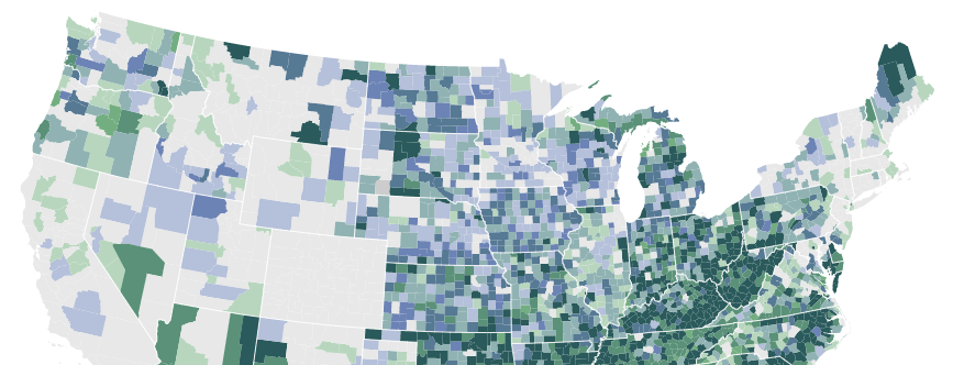
Contenu de datasetsList
Cette collection va donc permettre d’importer facilement tous les datasets de façon automatisée. L’objectif est d’obtenir in fine un data.frame pour chacune des 4 catégories de données : caractéristiques, véhicules, usagers et lieux. Chaque data.frame contiendra ainsi la fusion de toutes les années de données disponibles. J’ai créé une fonction nommée importDatasetsByTitle()
qui va nous permettre d’importer et de fusionner tous les fichiers d’accidents en les filtrant par leurs titres (thématiques) :
_#' Returns a data.frame that contains all the rows from the data files for a specific dataset provided by the data.gouv.fr platform_
_\# All the rows from the datasets whose the titles match 'titleFilter' will be merged together_
_#' @param datasetId The dataset ID from data.gouv.fr. It can be found within the source code of the dataset page within the "@id" attribute_
_#' @param titleFilter The string for filtering the datasets titles in order to select only the relevant ones_
_#' @param colTypes The column specification created through cols()_
_#' @param delim Single character used to separate fields within a record_
_#' @param stringLocale The datasets locale_
_#' @return The data.frame for the specified accidents category_
importDatasetsByTitle <- **function**(datasetId, titleFilter, colTypes, delim = ',', stringLocale = locale(encoding = "Latin1")) {
filteredDatasets <- fromJSON(paste('https://www.data.gouv.fr/datasets/', datasetId, '/rdf.json', sep=''))$\`@graph\` %>%
select(title, downloadURL) %>%
filter(str\_detect(title, titleFilter)) %>%
mutate(dataset = map2(downloadURL, delim, read\_delim, locale = stringLocale, col\_types = colTypes))
bind\_rows(filteredDatasets$dataset)
}
Note : La fonction importDatasetsByTitle()
peut tout à fait être utilisée pour importer et fusionner d’autres jeux de données sur datagouv.fr.
Les fichiers sont globalement propres, mais j’ai tout de même noté ces quelques points :
caracteristiques_2009.csv
, est au format TSV, allez comprendre pourquoi …an
, mois
, jour
et hhmm
0
devant les heures de 00 à 09 et devant les minutes de 01 à 09. La documentation n’étant pas claire sur ce point, il faut donc à priori faire notre propre interprétation lorsque l’on est face à des valeurs du type ‘45’ : s’agit-il de 04:05 ou de 04:50 ? Ou encore la valeur ‘1’ correspond à 00:01 ou à 01:00 ? Dans ce cas, j’ai considéré qu’il s’agissait d’heures (‘1’ = 01:00). Cela explique notamment pourquoi dans les graphiques par heures, il n’y a aucun accident entre minuit et 1h ... J’espère que cette colonne sera rapidement corrigée !La fonction toDate()
va nous permettre de reconstruire un objet datetime à partir des différentes variables :
#' Convert year, month, day and hm variables into a valid date object
#' [@param](http://twitter.com/param) year
#' [@param](http://twitter.com/param) month
#' [@param](http://twitter.com/param) day
#' [@param](http://twitter.com/param) hm concatenated hours and minutes
toDate <- function(year, month, day, hm) {
date <- str\_c('20', str\_pad(year, 2, "left", "0"), '-', str\_pad(month, 2, "left", "0"), '-', str\_pad(day, 2, "left", "0"), ' ')
if (str\_length(hm) == 1) {
hm <- str\_c('0', hm, ':00')
} else if (str\_length(hm) == 2) {
hm <- str\_c('0', str\_sub(hm, 1, 1), ':0', str\_sub(hm, 2, 2))
} else if (str\_length(hm) == 3 && str\_sub(hm, 1, 1) != 0) {
hm <- str\_c('0', str\_sub(hm, 1, 1), ':', str\_sub(hm, 2, 3))
} else if (str\_length(hm) == 3 && str\_sub(hm, 1, 1) == 0) {
hm <- str\_c(str\_sub(hm, 1, 2), ':0', str\_sub(hm, 3, 3))
} else {
hm <- str\_c(str\_sub(hm, 1, 2), ':', str\_sub(hm, 3, 4))
}
str\_c(date, ' ', hm)
}
\# Note : il est sûrement possible de faire quelque chose de plus propre et de plus optimisé pour formater les heures et minutes correctement ...
Importons maintenant les données pour chacune des 4 thématiques :
datasetId <- '53698f4ca3a729239d2036df'specificationsCols <- cols(
Num\_Acc = col\_character(),
com = col\_character(),
lat = col\_double(),
long = col\_double(),
dep = col\_character()
)
accidentsSpecifications <- importDatasetsByTitle(datasetId, 'caracteristiques\_(?!2009)', specificationsCols) _\# Handle 2009 file (in TSV format ...)_
accidentsSpecifications2009 <- read\_delim(
'https://www.data.gouv.fr/s/resources/base-de-donnees-accidents-corporels-de-la-circulation/20160422-111851/caracteristiques\_2009.csv',
'\\t',
locale = locale(encoding = "Latin1"),
col\_types = specificationsCols
)
accidentsSpecifications <- bind\_rows(accidentsSpecifications, accidentsSpecifications2009)_\# Add some alternative date formats to accidentSpecifications data.frame, it will be needed for the charts below_
accidentsSpecifications <- mutate(accidentsSpecifications,
datetime = ymd\_hm(pmap(list(an, mois, jour, hrmn), toDate)),
date = as.Date(datetime),
year = year(date),
wday = wday(date, label = TRUE),
hour = hour(datetime),
weekdayshours = update(datetime, year = 2017, month = 01, day = wday(date), minute = 0)
)accidentsLocations <- importDatasetsByTitle(
datasetId,
'lieux\_',
cols(
Num\_Acc = col\_character(),
voie = col\_character(),
v1 = col\_character()
)
) %>% inner\_join(accidentsSpecifications, by = "Num\_Acc")accidentsUsers <- importDatasetsByTitle(
datasetId,
'usagers\_',
cols(
Num\_Acc = col\_character(),
secu = col\_character()
)
) %>% inner\_join(accidentsSpecifications, by = "Num\_Acc")
accidentsVehicles <- importDatasetsByTitle(
datasetId,
'vehicules\_',
cols(
Num\_Acc = col\_character()
)
) %>% inner\_join(accidentsSpecifications, by = "Num\_Acc")
Maintenant que nous avons chargé les données dans des data.frame, essayons d’en visualiser quelques grandes tendances.
accidentsSpecifications %>%
ggplot(aes(x = year)) +
geom\_bar(fill = "#3e4c63") +
labs(
title = "Le nombre d'accidents de la circulation baisse jusqu'en 2013 \\npuis semble stagner ensuite",
x = "Année",
y = "Nombre d'accidents corporels de la circulation en France"
) +
theme\_minimal()
accidentsUsers %>%
filter(grav == 2) %>%
ggplot(aes(x = year)) +
geom\_bar(fill = "#3e4c63") +
labs(
title = "Le nombre de morts sur la route baisse jusqu'en 2013 \\npuis semble être en légère augmentation ensuite",
x = "Année",
y = "Nombre de morts sur la route en France"
) +
theme\_minimal()
accidentsSpecifications %>%
group\_by(date) %>%
summarize(nb\_accidents = n()) %>%
mutate(date = update(date, year = 2017)) %>%
group\_by(date) %>%
summarize(nb\_accidents = mean(nb\_accidents)) %>%
ggplot(aes(x = date, y = nb\_accidents, group = 1)) +
geom\_line(color = "#3e4c63") +
labs(
title = "Il y a moins d'accidents en août et pendant les fêtes de fin d'année",
x = "Jour de l'année",
y = "Nombre moyen d'accidents par jour"
) +
theme\_minimal() +
scale\_x\_date(date\_labels = "%B")
top10 <- accidentsSpecifications %>%
group\_by(date) %>%
summarize(nb\_accidents = n()) %>%
mutate(date = update(date, year = 2017)) %>%
group\_by(date) %>%
summarize(nb\_accidents = mean(nb\_accidents)) %>%
arrange(nb\_accidents) %>%
filter(row\_number() <= 10)
Top 10 des jours de l’année avec, en moyenne, le moins d’accidents
Attention, cela ne veut pas forcément dire que les usagers de la route sont plus prudents pendant les vacances. On peut supposer notamment qu’il y globalement moins de circulation durant le mois d’août par rapport au reste de l’année, et ce, malgré les pics de départs et retours de vacances. On peut voir que c’est bien le cas à Paris si l’on en croit cet article publié sur francebleu.fr : “Paris au mois d’août : ça roule mieux”. Pour pouvoir confirmer ce point, il faudrait cependant se reposer sur une véritable étude, ou pa exemple exploiter des statistiques provenant d’applications comme Waze si elles venaient à être mise à disposition.
Il est également intéressant d’observer cette courbe par département. On peut voir par exemple qu’en été, le nombre d’accidents baisse sensiblement à Paris alors que dans la même période, il augmente dans le var.
dayHours <- c(7:23, 0:6)
dayHoursLabels <- c('07', '08', '09', '10', '11', '12', '13', '14', '15', '16', '17', '18', '19', '20', '21', '22', '23', '00', '01', '02', '03', '04', '05', '06')accidentsSpecifications %>%
mutate(datetime = update(datetime, minutes = 0, seconds = 0)) %>%
group\_by(datetime) %>%
summarize(nb\_accidents = n()) %>%
mutate(hour = hour(datetime)) %>%
group\_by(hour) %>%
summarize(nb\_accidents = mean(nb\_accidents)) %>%
mutate(hour = factor(hour, levels = dayHours, labels = dayHoursLabels)) %>%
ggplot(aes(x = hour, y = nb\_accidents, group = 1)) +
geom\_col(fill = "#3e4c63") +
labs(
title = "Il y a plus d'accidents de la circulation entre 17h et 19h",
x = "Heure de la journée",
y = "Nombre moyen d'accidents par heure"
) +
theme\_minimal()
On voit un premier pic entre 8h et et 10h, puis un second beaucoup plus prononcé entre 17h et 19h. On peut supposer que ces pics correspondent aux allers et retours entre le domicile et le lieu de travail pendant lesquels le nombre de véhicules en circulation est globalement beaucoup plus important que sur le reste de la journée.
Il serait intéressant de comprendre pourquoi le pic des retours est beaucoup plus important que le pic des allers.
inner\_join(
accidentsUsers %>%
filter(grav == 2) %>%
group\_by(hour) %>%
summarize(nb\_deathlyaccidents = n\_distinct(Num\_Acc)),
accidentsSpecifications %>%
group\_by(hour) %>%
summarize(nb\_accidents = n\_distinct(Num\_Acc)),
by = 'hour'
) %>%
mutate(deathly\_accidents\_percentage = 100 \* (nb\_deathlyaccidents / nb\_accidents)) %>%
mutate(hour = factor(hour, levels = dayHours, labels = dayHoursLabels)) %>%
ggplot(aes(x = hour, y = deathly\_accidents\_percentage, group = 1)) +
geom\_col(fill = "#3e4c63") +
labs(
title = "Le pourcentage d'accidents mortels connait un pic entre minuit et 7h",
x = "Heure de la journée",
y = "Pourcentage d'accidents mortels"
) +
theme\_minimal()
Le taux d’accidents mortels connait un pic entre minuit et 7h. Là aussi, nous pouvons émettre quelques hypothèses : visibilité moindre, fatigue, une plage horaire plus propice à des comportements à risques (retours de soirée, etc).
inner\_join(
accidentsUsers %>%
filter(grav == 2) %>%
group\_by(wday) %>%
summarize(nb\_deathly\_accidents = n\_distinct(Num\_Acc)),
accidentsSpecifications %>%
group\_by(wday) %>%
summarize(nb\_accidents = n()),
by = 'wday'
) %>%
mutate(wday = factor(wday, levels=c('Mon', 'Tues', 'Wed', 'Thurs', 'Fri', 'Sat', 'Sun'), labels = c('Lundi', 'Mardi', 'Mercredi', 'Jeudi', 'Vendredi', 'Samedi', 'Dimanche'))) %>%
mutate(deathly\_accidents\_percentage = 100 \* (nb\_deathly\_accidents / nb\_accidents)) %>%
ggplot(aes(x = wday, y = deathly\_accidents\_percentage, group = 1)) +
geom\_col(fill = "#3e4c63") +
labs(
title = "Le pourcentage d'accidents mortels est plus important le week-end",
x = "Jour de la semaine",
y = "Pourcentage d'accidents mortels"
) +
theme\_minimal()
Là aussi, on peut imaginer que le plus fort taux d’accidents mortels durant le week-end est en partie dû au fait que cette période de la semaine est plus propice à des comportements à risques (retours de soirée, etc) mais il y a probablement d’autres facteurs qui entrent en jeu.
accidentsUsers %>%
filter(grav == 2) %>%
mutate(age = year(now()) - an\_nais) %>%
group\_by(year, age) %>%
summarise(accidenteds\_number = n()) %>%
group\_by(age) %>%
summarize(accidenteds\_number = mean(accidenteds\_number)) %>%
ggplot(aes(x = age, y = accidenteds\_number, group = 1)) +
geom\_vline(aes(xintercept = 25), colour = "#ccd7ea", size = 1) +
geom\_vline(aes(xintercept = 35), size = 1, colour = "#ccd7ea") +
geom\_line(color = "#3e4c63", size = 1.5) +
labs(
title = "Il y a le plus de décès sur la route dans la tranche des 25 - 30 ans",
x = "Age",
y = "Nombre annuel moyen de morts sur la route en fonction de l'age"
) +
theme\_minimal()
Le nombre de morts moyen est plus important dans la tranche des 25–30 ans. Attention, cela ne veut pas dire que cette tranche est plus à risque que les autres. En effet, on peut supposer que les usagers de cette tranche d’âge sont simplement les plus présents la route, d’où le nombre d’accidents plus important pour cette tranche.
accidentsUsers %>%
filter(catu == 1) %>%
group\_by(year, sexe) %>%
summarize(accidenteds\_number = n()) %>%
group\_by(sexe) %>%
summarize(accidenteds\_number = mean(accidenteds\_number)) %>%
mutate(sexe = factor(sexe, labels = c('Homme', 'Femme'))) %>%
ggplot(aes(x = sexe, fill = sexe, y = accidenteds\_number)) +
geom\_col() +
scale\_fill\_manual(values = c("#2b8cbe", "#fa9fb5")) +
guides(fill=FALSE) +
labs(
title = "Il y a moins d'accidents impliquant des femmes que des hommes",
x = "Sexe",
y = "Nombre annuel moyen d'accidents de la route par sexe"
) +
theme\_minimal()
Là encore, attention, cela ne veut pas dire que les femmes conduisent mieux que les hommes. Les hommes sont peut-être simplement globalement plus présents sur la route que les femmes. On peut notamment trouver quelques informations à ce sujet dans une enquête de 2013 réalisée par l’Observatoire de la mobilité en Île-de-France.
deathsData <- accidentsSpecifications %>%
inner\_join(accidentsUsers) %>%
filter(grav == 2) %>%
filter(!is.na(lat) & !is.na(long) & lat != 0 & long != 0) %>%
mutate(lat = lat / 100000, long = long / 100000) %>%
filter(lat > 40 & long < 15) %>%
select(Num\_Acc, lat, long)ggplot(deathsData) +
geom\_polygon(data = map\_data("france"), aes(x=long, y = lat, group = group), fill = "#e5e5e5") +
geom\_point(deathsData, mapping = aes(x = long, y = lat), size = 0.1, color = "#3e4c63", alpha = 0.3) +
coord\_fixed(1.3) +
labs(
title = "Personnes décédées à la suite d'un accident de la circulation"
) +
theme\_void()
bikeAccidentsData <- accidentsSpecifications %>%
inner\_join(accidentsVehicles) %>%
inner\_join(accidentsUsers) %>%
filter(catv == '01') %>%
filter(dep == '750') %>%
mutate(lat = lat / 100000, long = long / 100000) %>%
mutate(grav = factor(grav, levels = c(1,4,3,2), labels = c('Indemne', 'Blessé léger', 'Blessé hospitalisé', 'Tué'))) %>%
select(Num\_Acc, grav, lat, long)ggmap(get\_map(location = c(lon = 2.3488, lat = 48.8534), source = "google", zoom = 12)) +
geom\_point(data = bikeAccidentsData, mapping = aes(x = long, y = lat, fill = grav), colour="#000000", size = 3, pch=21) +
labs(
title = "Les accidents de vélo à Paris selon la gravité",
fill = "Gravité"
) +
theme\_void() +
scale\_fill\_brewer(palette = "Reds", na.value = "#bababa") +
theme(legend.position="bottom")
La première carte n’a que très peu d’intérêt puisque les zones où l’on retrouve le plus d’accidents correspondent bien sûr aux grands axes routiers ainsi qu’aux grandes villes. Il peut être en revanche intéressant de visualiser les accidents de la route par commune, voire par quartier pour identifier des axes dangereux par exemple.
accidentsVehicles %>%
filter(catv == '07') %>%
mutate(choc = factor(choc, levels = rev(c(1,3,2,4,6,5,8,7,9)), labels = rev(c('Avant','Avant gauche','Avant droit','Arrière','Arrière gauche','Arrière droit','Côté gauche','Côté droit','Chocs multiples (tonneaux)')))) %>%
group\_by(choc) %>%
summarize(accidenteds\_number = n()) %>%
filter(!is.na(choc)) %>%
ggplot(aes(x = choc, y = accidenteds\_number)) +
geom\_col(fill = "#3e4c63") +
labs(
title = "Le point de choc le plus fréquent est \\n l\\'avant du véhicule",
x = "Point de choc",
y = "Nombre de voitures"
) +
theme\_minimal() +
coord\_flip()
]]>Des données climatologiques sont disponibles en Licence Ouverte Etalab sur Météo-France au travers de bulletins climatiques mensuels. Malheureusement, seuls des résumés mensuels (températures moyennes, cumuls de précipitation, etc) sont accessibles. Impossible d’y trouver des données quotidiennes donc (Météo-France, si vous me lisez …).
Dans le code R ci-dessous, les données ont déjà été préalablement nettoyées, structurées et stockées au sein d’un triplestore RDF que nous pouvons donc directement interroger en SPARQL à l’aide du package {SPARQL}
.
Comme je n’ai que les données mensualisées sous la main, j’ai tenté de visualiser certaines variables en plaçant les mois de l’année en abscisses (de janvier à février) et les années en ordonnées (de 1999 à 2017) dans l’espoir de pouvoir mettre en évidence des mois “exceptionnels” (en terme de pluie, d’insolation, etc). Malheureusement, comme je le pressentais, le rendu n’est finalement pas très probant et nous n’apprenons pas grand chose. En effet, les données étant résumées par mois, elles s’en retrouvent trop “lissées”. Les données quotidiennes auraient permis de mettre en évidence des pics de chaleur ou de pluie ayant duré quelques jours.
Malgré tout, on peut quand même y repérer facilement quelques “exceptions”. Par exemple, le mois de juin 2016 a été particulièrement pauvre en insolation avec un total de seulement 90 heures. Voir par exemple l’article du Télégramme à ce sujet : Bretagne. Mais où est passé le soleil ?. On peut également voir que le mois de janvier 2017 a été particulièrement froid avec une moyenne des températures minimales de -0.3°. Voir l’article du Télégramme à ce sujet.
Note : L’objectif était simplement d’avoir un prétexte pour continuer mon apprentissage de R, du format R Markdown ainsi que de certains packages par la pratique. On pourrait bien sûr améliorer la pertinence de cette mini-infographie avec des données quotidiennes, en y ajoutant de l’interactivité, par exemple en permettant à l’utilisateur de comparer les données avec celles des autres stations météo, exploiter d’autres variables, etc.
endpoint <- "" _\# Configure your triplestore endpoint here_
query <- "
SELECT ?label xsd:string(?date) as ?date ?hrr ?ins ?tn ?tx WHERE {
?weatherReport a weather:Report ;
weather:linkedToStation ?station ;
weather:reportDate ?date ;
weather:hrrMm ?hrr ;
weather:instH ?ins ;
weather:tnC ?tn ;
weather:txC ?tx .
?station rdfs:label 'Rennes' ;
rdfs:label ?label .
}
"
results <- SPARQL(endpoint, query)$results %>%
as.tibble() %>%
mutate(
year = factor(year(date)),
month = factor(month(date), labels = c("janvier", "février", "mars", "avril", "mai", "juin", "juillet", "août", "septembre", "octobre", "novembre", "décembre"))
)
results %>%
ggplot(aes(x = year, y = hrr, group = 1)) +
geom\_col(fill = "#4286f4") +
labs(
title = "La pluie à Rennes depuis 1999",
x = "Année",
y = "Hauteur des précipitations cumulées par mois (millimètres)"
) +
facet\_wrap(~month, ncol = 1) +
scale\_x\_discrete(breaks=seq(1999, 2017, 2)) +
theme\_minimal() +
theme(axis.text.y = element\_text(size = rel(0.8)))
results %>%
ggplot(aes(x = year, y = ins, group = 1)) +
geom\_col(fill = "#f4c141") +
labs(
title = "L'insolation à Rennes depuis 1999",
x = "Année",
y = "Durée d'insolation par mois (heures)"
) +
facet\_wrap(~month, ncol = 1) +
scale\_x\_discrete(breaks=seq(1999, 2017, 2)) +
theme\_minimal() +
theme(axis.text.y = element\_text(size = rel(0.8)))
results %>%
ggplot(aes(x = year, y = tx, group = 1)) +
geom\_col(fill = "#c41313") +
labs(
title = "Les températures maximales moyennes à Rennes depuis 1999",
x = "Année",
y = "Moyenne des températures maximales par mois (C°)"
) +
facet\_wrap(~month, ncol = 1) +
scale\_x\_discrete(breaks=seq(1999, 2017, 2)) +
theme\_minimal() +
theme(axis.text.y = element\_text(size = rel(0.8)))
results %>%
ggplot(aes(x = year, y = tn, group = 1)) +
geom\_col(fill = "#0b3260") +
labs(
title = "Les températures minimales moyennes à Rennes depuis 1999",
x = "Année",
y = "Moyenne des température minimale par mois (C°)"
) +
facet\_wrap(~month, ncol = 1) +
scale\_x\_discrete(breaks=seq(1999, 2017, 2)) +
theme\_minimal() +
theme(axis.text.y = element\_text(size = rel(0.7)))
]]>Je vais m’appuyer pour cela sur un exemple réel, Datainfogreffe, qui est un cas d’école intéressant puisqu’on peut y trouver de nombreuses erreurs à éviter. Utilisateur de leurs données depuis quelques temps, je ressentais le besoin d’exprimer mon désarrois à travers un billet. Le but est de sensibiliser les fournisseurs de données sur l’importance de la qualité de la donnée (et pourquoi pas faire réagir Datainfogreffe par la même occasion …). En effet, à mon sens, faire de l’Open Data ne se limite pas simplement à mettre en ligne quelques CSV !
Infogreffe est un service de diffusion de l’information légale et officielle sur les entreprises. Datainfogreffe est la plateforme qui met à disposition ces données. Des accès payants aux APIs sont proposés via un système de crédits. Pour notre plus grand plaisir, une partie des données est cependant accessible en Open Data au travers de la plateforme OpenDataSoft. Ces jeux de données, annualisés, concernent notamment :
[edit] Malgré les problèmes décelés dans les données ouvertes Datainfogreffe, elles n’en restent pas moins une source d’information très riche,utile et unique à propos des entreprises en France !
Décortiquons donc tout cela pour essayer d’identifier les problèmes relatifs à ces données.
Je ne m’attarderai pas sur le format des fichiers proposés par datainfogreffe : Les jeux sont en effet exportables en CSV et ce format me semble être tout à fait adapté car très simple à exploiter.
Pour chacune des 3 catégories de données, nous avons à disposition un fichier par année (de 2012 à 2017 pour les radiations et créations d’entreprises, et de 2014 à 2017 pour les chiffres clés).
Dans le cas de jeux de données annualisées, une colonne qui existe sur l’année N devrait également exister sur l’année N+1. Autrement dit, on ne devrait pas voir de colonne disparaître au fil des années.
Sur Datainfogreffe, dans les fichiers des immatriculations d’entreprises, le secteur d’activité est renseigné de 2012 à 2015, mais ce n’est plus le cas à partir de 2016. Pas pratique si nous voulons réaliser une étude sur l’évolution des créations d’entreprises par secteur d’activité par exemple.
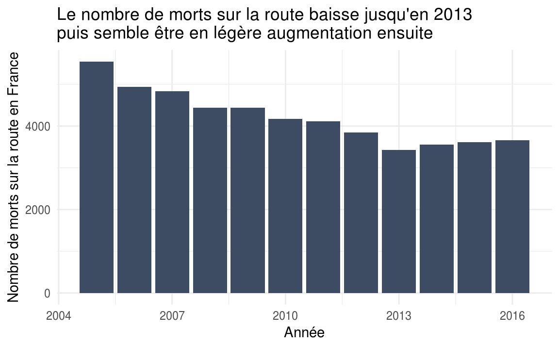
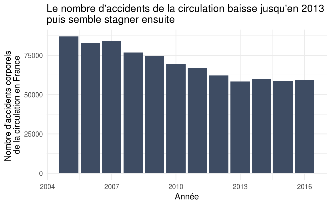
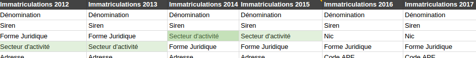
Le secteur d’activité ? C’est has- been en 2016 !
Inversement, une colonne qui existe sur l’année N devrait exister sur l’année N-1. On peut toutefois modérer ce point car il peut s’agir de nouvelles variables qui n’existaient pas auparavant.
Par exemple, dans les fichiers des chiffres clés de Datainfogreffe, le code Insee du département de l’entreprise “Num. dept.” n’existe qu’à partir de l’année 2015.
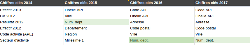
Les départements ça n’existait pas encore en 2014.
Les variables ne devraient pas changer de nom entre un dataset de l’année N et celui de l’année N+1. Idéalement, les colonnes ne devraient pas non plus être réordonnées entre 2 années.
Chez Datainfogreffe, il y a pas mal de libertés concernant ce point : selon les années, on retrouve du “Code activité (APE)” et du “Code APE”, du “Date immatriculation” et du “Date d’immatriculation”, du “Date radiation” et du “Date de radiation”, etc. On comprend facilement que cela peut être un gros frein pour automatiser l’import de toutes les années de données par exemple.
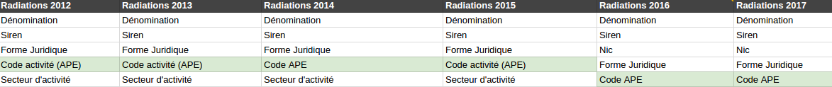
Et si on changeait le nom de la colonne de temps en temps ?
Le nommage des colonnes d’un même dataset devrait être consistant : par exemple, si une colonne est au singulier, les autres devraient l’être également. Si une colonne est écrite en snake_case, toutes les colonnes devraient respecter ce format.
On peut illustrer ce point avec le jeu de données 2014 des chiffres clés de Datainfogreffe, dans lequel on peut trouver une colonne Effectif 2013
et une colonne Effectifs 2014
.
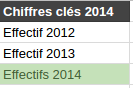
Aller, en 2014 on va mettre du pluriel pour casser la monotonie
J’entends par colonne parasite, des colonnes dont le nommage ou la documentation ne permettent pas de savoir ce qu’elles contiennent.
Sur Datainfogreffe, on peut par exemple trouver une colonne intitulée test1
dans les chiffres clés 2016 & 2017, ou encore une colonne Column 28
dans les chiffres clés 2014. Je vous mets au défi de m’expliquer leur contenu.
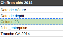
Bonjour Column 28, tu fais quoi dans la vie ?
[edit] Suite à la publication de mon article, Datainfogreffe a nettoyé les différents jeux de données de ces colonnes “parasites”.
Les jeux de données peuvent contenir plusieurs années de données à condition qu’il y ait une variable année
clairement identifiée dans le jeux de données — Chaque ligne de données étant liée à une et une seule année. Une alternative moins propre est de construire autant de colonnes qu’il y a d’années pour une variable donnée.
Dans le cas où les fichiers sont annualisés (un fichier par année), on ne s’attend naturellement pas à retrouver plusieurs années de données au sein d’un même dataset.
Chez Datainfogreffe, dans les fichiers des chiffres clés, nous retrouvons l’année N, mais aussi l’année N-1 et l’année N-2.
Par exemple, le fichier des chiffres clés 2014 contient également les données des années 2013 et 2012. On y trouve ainsi les variables CA 2012
, CA 2013
, CA 2014
.
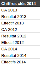
Dans le fichier 2O14, on va rajouter 2013 et 2012 pour que ce soit bien complet
Comme chaque dataset reprend les données des années N-1 et N-2 , on a donc une duplication d’informations entre les fichiers. Par exemple, le chiffre d’affaire 2015 sera présent dans les fichiers 2015, 2016 et 2017.
Vérifions avec R que nous avons bien le même chiffre d’affaire 2015 dans les fichiers 2015 et 2016 :
library(tidyverse)mainIndicators2015 <- read\_csv2('chiffres-cles-2015.csv')
mainIndicators2016 <- read\_csv2('chiffres-cles-2016.csv')mainIndicators <- inner\_join(mainIndicators2015, mainIndicators2016, by = 'Siren') %>%
select(Siren, \`CA 1.x\`, \`CA 2.y\`)mainIndicatorsmainIndicators %>%
filter(\`CA 1.x\` != \`CA 2.y\`)\# A tibble: 615,482 x 3
Siren \`CA 1.x\` \`CA 2.y\`
<chr> <int> <int>
1 349735860 225480 225480
2 349737460 44630 44630
3 349738856 348060 348060
4 349742130 NA NA
5 349745414 NA NA
6 349746420 707978 707978
7 349746529 1017859 1017859
8 349748442 NA NA
9 349749911 NA NA
10 349751081 12755788 12755788
\# ... with 615,472 more rows\# A tibble: 6,486 x 3
Siren \`CA 1.x\` \`CA 2.y\`
<chr> <int> <int>
1 349805457 2805204 2805000
2 325165579 190968 190000
3 324925296 867013 867000
4 324977735 1537350 1537
5 325165579 190968 190000
6 325184513 1796937 1796000
7 324042761 367849 652223
8 324716026 1442909 1442000
9 324716141 4000171 4000000
10 301670816 394720 395
\# ... with 6,476 more rows
Le résultat est sans appel : nous avons 6 486 entreprises sur 615 482 pour lesquelles nous n’avons pas le même CA 2015 ! Et certaines différences sont … saisissantes : on passe de 1 537 350€ à 1 537€ de CA 2015 entre les deux fichiers. Hum, on dirait qu’il y a eu comme une division par 1 000 entre les deux ... Lorsqu’on est face à de tels cas, quel fichier “croire” ?
7 mois plus tard, ces bizarreries n’ont toujours pas été corrigées ou expliquées par Datainfogreffe.
Si vous choisissez de stocker plusieurs années dans un même fichier dans des colonnes différentes, il faut que le nom de la colonne permette d’identifier clairement l’année.
Sur les fichiers des chiffres clés postérieurs à 2015, nous ne savons même pas à quelles années correspondent les colonnes puisque l’on a des nommages du type : “CA 1”, “CA 2”, “CA 3”, pratique …
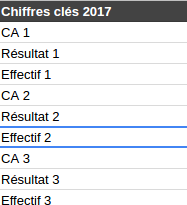
C’est quelle année dans CA 2 ? Je sais pas j’ai fait un random pour brouiller les pistes.
Un jeu de données devrait contenir uniquement des données relatives à la thématique dudit jeu. Logique, non ?
Pas pour Datainfogreffe. En effet, on peut trouver dans les radiations et les immatriculations 2017 des informations … sur les chiffres clés (CA, résultat, effectif). Ce n’est pas comme si ces variables étaient déjà présentes en triple dans les datasets des chiffres clés eux-mêmes.
Qu’est-ce-que tu fais là ?
D’ailleurs, allons vérifier ce que contient la colonne CA
dans le dataset des immatriculations 2017 :
newCompanies2017 <- read\_csv2('entreprises-immatriculees-2017.csv')
newCompanies2017 %>%
filter(!is.na(CA)) %>%
select(Siren, CA)\# A tibble: 1 x 2
Siren CA
<int> <chr>
1 399323914 5046
Étrange, il n’y a en tout et pour tout qu’une seule entreprise avec un CA non vide sur les 129 236 entreprises que compte le fichier des entreprises immatriculées en 2017.
Une colonne ne devrait apparaître qu’une seule fois avec un même nom dans un fichier, il ne devrait pas y avoir de doublons.
Sur Datainfogreffe, on peut par exemple trouver ce problème dans les radiations d’entreprises 2015, où nous avons le droit à 2 colonnes Géolocalisation
, mais aussi 2 colonnes Date de radiation
.
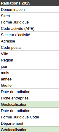
Parce qu’un homme averti en vaut deux
closedCompanies2015 <- read\_csv2('entreprises-radiees-2015.csv') %>%
select(Siren, \`Géolocalisation\`, \`Géolocalisation\_1\`, \`Date de radiation\`, \`Date de radiation\_1\`)
closedCompanies2015 %>%
filter(\`Géolocalisation\` != \`Géolocalisation\_1\`)closedCompanies2015 %>%
filter(\`Date de radiation\` != \`Date de radiation\_1\`)\# A tibble: 0 x 5
\# ... with 5 variables: Siren <int>, Géolocalisation <chr>, Géolocalisation\_1 <chr>, Date de radiation <date>, Date de radiation\_1 <date>\# A tibble: 0 x 5
\# ... with 5 variables: Siren <int>, Géolocalisation <chr>, Géolocalisation\_1 <chr>, Date de radiation <date>, Date de radiation\_1 <date>
Au moins, les valeurs dans les colonnes en doublon sont identiques.
Une information ne devrait être présente qu’une seule fois dans un jeu de données, sous sa forme la plus facile à exploiter. Il est inutile d’avoir la même information sous différents formats.
Datainfogreffe illustre très bien ce point dans les radiations d’entreprises 2015 où nous avons une colonne Date de radiation
mais également 3 colonnes jour
, mois
, annee
représentant la même information. C’est parfaitement inutile, et cela augmente la taille des fichiers pour rien.
Parce qu’on ne sait jamais, on va vérifier la cohérence entre ces deux variables avec R :
closedCompanies2015 <- read\_csv2('/home/vbroute/Téléchargements/entreprises-radiees-2015.csv') %>%
select(Siren, \`Date de radiation\`, jour, mois, annee)closedCompanies2015 %>%
mutate(
date1 = ymd(\`Date de radiation\`),
date2 = ymd(paste(annee, mois, jour))
) %>%
filter(date1 != date2)\# A tibble: 46,407 x 7
Siren \`Date de radiation\` jour mois annee date1 date2
<int> <date> <int> <int> <int> <date> <date>
1 409955838 2015-08-07 8 7 2015 2015-08-07 2015-07-08
2 422861054 2015-08-07 8 7 2015 2015-08-07 2015-07-08
3 431905512 2015-08-07 8 7 2015 2015-08-07 2015-07-08
4 433752623 2015-08-07 8 7 2015 2015-08-07 2015-07-08
5 435198932 2015-08-07 8 7 2015 2015-08-07 2015-07-08
6 437993900 2015-08-07 8 7 2015 2015-08-07 2015-07-08
7 437933278 2015-08-07 8 7 2015 2015-08-07 2015-07-08
8 441522828 2015-08-07 8 7 2015 2015-08-07 2015-07-08
9 444694061 2015-08-07 8 7 2015 2015-08-07 2015-07-08
10 452440704 2015-08-07 8 7 2015 2015-08-07 2015-07-08
\# ... with 46,397 more rows
Bingo : il y a 46 407 lignes sur 130 272 dans les quelles les dates ne sont pas les mêmes selon qu’on exploite la colonne Date de radiation
ou les colonnes jour
, mois
et annee
. Cela ressemble à une inversion entre les jours et les mois dans l’une des deux variables … mais laquelle ?
Pour proposer un jeu de données de bonne qualité, il faut des données de bonne qualité, vérifiées, validées, etc. Les données étant ouvertes, elles sont susceptibles d’être transformées et rediffusées par de nombreux utilisateurs — qui n’ont pas forcément envie de diffuser des informations erronées.
Nous avons déjà repéré précédemment de nombreuses incohérences au niveau des chiffres clés et des dates de radiations et nous pouvons encore continuer un peu, pour le plaisir.
Par exemple, les coordonnées géographiques des entreprises sont complètement fausses, elles ne correspondent pas à la localisation de l’entreprise, mais à la localisation du centre de la commune d’implantation. Faisons le test sur les entreprises Rennaises radiées en 2015 :
closedCompanies2015 <- read\_csv2('entreprises-radiees-2015.csv')%>%
select(Siren, \`Géolocalisation\`, \`Code postal\`)closedCompanies2015 %>%
filter(\`Code postal\` == '35000')\# A tibble: 355 x 3
Siren Géolocalisation \`Code postal\`
<int> <chr> <chr>
1 384982047 48.1116364246, -1.6816378334 35000
2 788545127 48.1116364246, -1.6816378334 35000
3 504870775 48.1116364246, -1.6816378334 35000
4 791212269 48.1116364246, -1.6816378334 35000
5 523084986 48.1116364246, -1.6816378334 35000
6 788994747 48.1116364246, -1.6816378334 35000
7 479507808 48.1116364246, -1.6816378334 35000
8 511016297 48.1116364246, -1.6816378334 35000
9 403610736 48.1116364246, -1.6816378334 35000
10 530015577 48.1116364246, -1.6816378334 35000
\# ... with 345 more rows
D’après Datainfogreffe, les 355 entreprises radiées en 2015 à Rennes sont toutes situées au point de coordonnées (48.1116364246, -1.6816378334). Ils devaient être un peu à l’étroit …
Toujours dans le même jeu de données, allons faire un tour du côté des codes postaux, pour voir ce qu’il s’y cache. Un code postal contient 5 chiffres, regardons si il y en a qui dérogent à cette règle :
closedCompanies2015 <- read\_csv2('entreprises-radiees-2015.csv')%>%
select(Siren, \`Code postal\`)closedCompanies2015 %>%
filter(str\_length(\`Code postal\`) != 5)
\# A tibble: 126 x 2
Siren \`Code postal\`
<int> <chr>
1 529857021 FL 333
2 790120745 3530
3 398308874 WIMODD
4 407777010 1030
5 805013141 2035
6 448367599 4070
7 794245241 .
8 NA SOISSONS
9 804722460 1140
10 484651443 8050
\# ... with 116 more rows
Visiblement, je n’ai pas la même notion de code postal que Datainfogreffe. Je vais m’arrêter là, mais si vous fouillez un peu, vous trouverez très certainement de nombreuses autres bizarreries dans ces données.
De telles erreurs dans des données publiques sont d’autant plus graves qu’elles concernent des entreprises. La diffusion de fausses données peut en effet leur porter préjudice. Imaginez que l’on publie un CA divisé par 1000 pour une entreprise ? Ou bien qu’on indique qu’une entreprise est fermée alors que ce n’est pas le cas ? (si vous cherchez bien, vous en trouverez dans le fichier des radiations 2017 …).
Un jeu de données de bonne qualité est un jeu de données qui est mis à jour régulièrement. Sur des données annualisées, on s’attend à voir une mise à jour par an.
L’intention de Datainfogreffe est louable dans le sens où les jeux de données de l’année courante sont mis à jour au fil de l’année. Cela devient problématique lorsque ces mises à jour s’arrêtent en cours d’année … A l’heure où j’écris ces lignes (26 septembre 2017), le dataset des radiations 2017 n’a pas été mis à jour depuis le mois de mai, et celui des immatriculations 2017 ne l’a pas été depuis le mois de juillet.
[edit] Après vérification, il apparaît que les données des radiations et des immatriculations 2017 sont bien mises à jour régulièrement. En revanche, le site ainsi que l’API indiquent des dates de mises à jour totalement dépassées pour ces 2 jeux de données.
La structure d’un jeu de données Open Data ne devrait pouvoir être modifiée qu’à condition que les-dites modifications soient extrêmement bien documentées et que les utilisateurs en soit informés.
En effet, lorsque l’on crée une étude basée sur un ou plusieurs jeux de données, il est fort irritant de ré-exécuter le code quelques semaines plus tard et de constater que toute la structure des fichiers a changé — et qu’il faut jouer aux devinettes pour comprendre les modifications qui ont pu être faites.
Du côté de datainfogreffe, je ne compte plus les modifications de structures en tout genre. J’y ai même repéré des suppressions de données : il y a quelques temps encore, nous avions accès aux chiffres clés de 2011, ce qui n’est plus le cas aujourd’hui.
La documentation qui doit accompagner les données est bien entendu indispensable. Vous trouverez un bon exemple de documentation du côté de la base SIRENE qui se trouve être vraiment complète : description de chaque champs, valeurs possibles, typage des valeurs, longueur, etc.
A l’inverse, pour ce qui est de Datainfogreffe, la documentation des jeux de données est pour ainsi dire quasi inexistante.
La doc ? C’est pour les nazes !
En plus d’une bonne documentation, il est important de proposer un espace public (système de commentaires, forum, etc) sur lequel les utilisateurs de données peuvent poser des questions aux producteurs (ou aux autres utilisateurs). L’intérêt d’un espace d’échange public par rapport à un simple formulaire de contact est bien sûr que les réponses soient partagées et consultables par tous.
Malheureusement, sur Datainfogreffe, seul un formulaire de contact est disponible. (quelqu’un a-t’il déjà reçu une réponse ?)
L’avènement de l’Open Data permet aujourd’hui d’avoir accès à une abondance de données ouvertes en tout genre, sur de très nombreuses thématiques, et c’est très bien.
Néanmoins, pour que cette masse de données puisse être comprise et exploitée par les utilisateurs (sans quoi elles ne servent à rien), la qualité doit être au centre des attentions des producteurs.
La qualité des données est d’autant plus importante lorsque des informations erronées peuvent porter directement atteinte aux entités concernées (entreprises, communes, écoles, etc). Les producteurs ne doivent donc pas perdre de vue que leurs données sont susceptibles d’être re-publiées dans de nombreux formats, via de nombreux canaux et dans des contextes très variés.
J’ai l’impression qu’avec le temps, cela va globalement dans le bon sens mais il faut continuer à accompagner, former et outiller les fournisseurs afin que la qualité des données ouvertes continue de s’améliorer.
Par exemple, la base SIRENE, ouverte en début d’année 2017 est plutôt de très bonne qualité à mon sens. Les structures des fichiers sont claires et bien documentées, les mises à jour (bi-annuelles, mensuelles et quotidiennes) sont suivies, il y a un espace d’échange accessible via la plateforme data.gouv.fr , etc.
J’invite donc Datainfogreffe à embrasser la bonne voie de l’évolution de l’Open Data en corrigeant les nombreux problèmes que j’ai pu déceler dans les jeux de données afin d’aboutir à une source d’information riche et de qualité.
]]>The TextGenerator is at first a PHP package that allows to produce texts from data by using a template in which functions calls can take place.
In addition to this package, an add-on for Google Spreadsheet is available and allows to generate narratives directly from a Spreadsheet, through a handy interface. We will use the Spreadsheet Add-on for the tutorial.
In a nutshell, the TextGenerator takes as input a dataset and a template, and outputs the texts generated from them. A lot of useful functions can be used within the template : you can shuffle sentences, pick up a random word from a list, condition the display of some parts from your narrative, loop on sub-data, assign variables, etc …
It aims to produce narratives that seem natural from datasets of any sizes.
For the tutorial, we will take some actors data from Wikidata and push them into a Google Spreadsheet document. Then, we will install the TextGenerator Add-on for Spreadsheet and use it to generate the narratives from our data. Let’s go !
Wikidata is a collaborative knowledge base launched by the Wikimedia Foundation in 2012. It aims to store structured data that come mainly from Wikipedia. It includes some other sources of data like Freebase, that has been shut down in May 2016.
The interesting thing is that Wikidata relies on Linked Data standards. In a nutshell, it allows you to retrieve RDF datasets. RDF is the graph data model of the Linked Data, in which the data are structured into “subject - predicate - object” triples, and offers several serializations such as RDF-XML, N3, Turtle, etc. Moreover, you can easily query the data with the available endpoint by using SPARQL language. C_urrently, Wikidata stores 1,262,008,154 triples._
For your information, DBPedia is also a great public source of data that also provides a SPARQL Endpoint_. An interesting benefit from DBPedia over Wikidata is that the predicates are human readable. On the other hand, the data seems to be more messy than in Wikidata. I have experienced it when querying data from actors, where the birthplaces were sometimes objects, sometimes literals strings for instance. C_urrently_, DBPedia stores 438,038,621 triples._
Let’s run our SPARQL query on Wikidata endpoint in order to retrieve our data for film actors. For the tutorial, we will retrieve their name, gender, country, demonym, birth place, birth date, number of children and the awards won. You just have to copy/paste the query below into the field :
PREFIX wdt: <[http://www.wikidata.org/prop/direct/](http://www.wikidata.org/prop/direct/)\>
PREFIX wd: <[http://www.wikidata.org/entity/](http://www.wikidata.org/entity/)\>
PREFIX pq: <[http://www.wikidata.org/prop/qualifier/](http://www.wikidata.org/prop/qualifier/)\>
PREFIX rdfs: <[http://www.w3.org/2000/01/rdf-schema#](http://www.w3.org/2000/01/rdf-schema#)\>
PREFIX p: <[http://www.wikidata.org/prop/](http://www.wikidata.org/prop/)\>
SELECT
(MAX(?label) AS ?label)
(MAX(?genderLabel) AS ?gender)
(MAX(?countryLabel) AS ?country)
(MAX(?demonym) AS ?demonym)
(MAX(?birthPlaceLabel) AS ?birthPlace)
(MAX(?birthCountryLabel) AS ?birthCountry)
(MAX(?birthDate) AS ?birthDate)
(MAX(?numberOfChildren) AS ?children)
(CONCAT('\[', GROUP\_CONCAT(DISTINCT ?awardData; SEPARATOR = ','), '\]') AS ?awards)
(COUNT(?awardData) AS ?awardsCount)
WHERE {
?s wdt:P106 wd:Q10800557 . #occupation : filmActor
?s rdfs:label ?label . FILTER(lang(?label) = 'en') .
?s wdt:P21 ?gender .
?gender rdfs:label ?genderLabel FILTER(lang(?genderLabel) = 'en') .
?s wdt:P569 ?birthDate .
?s wdt:P27 ?country . FILTER(?country != wd:Q403) .
?country rdfs:label ?countryLabel FILTER(lang(?countryLabel) = 'en') .
?country wdt:P1549 ?demonym FILTER(lang(?demonym) = 'en') .
?s wdt:P19 ?birthPlace .
?birthPlace rdfs:label ?birthPlaceLabel FILTER(lang(?birthPlaceLabel) = 'en') .
?birthPlace wdt:P17 ?birthCountry .
?birthCountry rdfs:label ?birthCountryLabel FILTER(lang(?birthCountryLabel) = 'en') .
OPTIONAL {?s wdt:P1971 ?numberOfChildren} .
?s p:P166 ?award .
?award pq:P585 ?awardDate .
?award pq:P1686 ?awardMovie .
?awardMovie rdfs:label ?awardMovieLabel FILTER(lang(?awardMovieLabel) = 'en') .
BIND(CONCAT('{"movielabel":"', ?awardMovieLabel, '","movieyear":"', xsd:string(YEAR(?awardDate)), '"}') AS ?awardData)
}
GROUP BY ?s
LIMIT 100
Note : I have excluded Serbian actors in the query to avoid a weird encoding issue that break some lines in the CSV file, I will try to find a better fix …
After running the query, you can download the result as CSV dataset by clicking on “Download” > “CSV”. Then, you can import your CSV dataset into a new Spreadsheet Document on Google Drive.
Note : The spreadsheet plugin is no longer available.
In order to install the TextGenerator add-on, you just have to go to this link and click on the “install” button.
As an alternative way, from a spreadsheet document, you can go to Add-ons > Download add-ons, search for “TextGenerator” and install it.
Once it has been installed, the first step is to click on the column where you want the narratives to be inserted in your Spreadsheet. With our sample actors dataset, we will generate them into the column K. Then, you can run the add-on by clicking on add-ons > TextGenerator > Generate Texts, it will open a sidebar :
All the parameters including the template will be saved for the current active column so you can retrieve them when you re-open your document. Moreover, it allows you to build multiple templates on multiple columns.
The fields from the sidebar are self-explanatory and come with default values, exept for the template. Clicking on the template field will open a larger editor :
The template field could be improved in the future by adding a preview tab and syntatic coloration
There are some tabs in which you can find the template editor and the complete documentation of TextGenerator. Below the template field, there are shortcut buttons to insert tags or function calls within your template.
A tag is like a variable, they allow to insert values from the dataset within the generated narratives. They are named after the head row of the sheet. For instance, the tag “@label” will be replaced by “Donald Sutherland” value for the narrative related to the first row in our dataset.
A function call allows you to provide some intelligence to your template. For instance, you can shuffle some sentences, output a random word from a list, add conditions in order to display or hide some parts of the text, etc. All the available functions are documented within the “Documentation” tab.
Here is our sample template, it is far from perfect, but feel free to improve it :
#set{ @he|#if{ @gender == 'male'|He|She}};;
#set{ @his|#if{ @gender == 'male'|his|her}};;
#set{ @demonym\_first\_letter|#filter{substring| @demonym|0|1}};;
#set{ @demonym\_prefix|#if{ @demonym\_first\_letter in \['A', 'E', 'I', 'O', 'U', 'Y'\]|an|a}};;
#set{ @formated\_birthdate|#filter{date| @birthdate|Y-m-d\\T00:00:00\\Z|F d, Y}};;
#set{ @age|#expr{#filter{timestamp|Y} - #filter{date| @birthdate|Y-m-d\\T00:00:00\\Z|Y}}};; @label is @demonym\_prefix @demonym #if{ @gender == 'male'|actor|actress} born in @birthplace, @birthcountry on @formated\_birthdate. ;;
#shuffle{ |;;
#random{Throughout|During|All along} @his career in @country, @label has won @awardscount #random{award|price|trophy}#if{ @awardscount > 1|s} for #loop{ @awards|\*|false|, | and | @movielabel in @movieyear}.|;;
@he is #random{now|} @age years old#if{ @children > 0| and has @children #if{ @children > 1|children|child}}.;;
}
Once we have set the template, the last step is to press the button “Generate” to get our narratives :
TextGenerator is not only an Add-on for Spreadsheet, but it is also a PHP Package available on packagist. You can also fork the sources on GitHub. In that way, you can include it in your projects in order to do a lot more things that what have been described in this short tutorial !
If you encounter a bug or an issue, feel free to report it in the GitHub issues. At last, as this is an Open Source project, you are of course welcome to contribute !